The previous chapter built a map. A region polygon, map_biomes() to classify every cell, plot_biome_map() to draw the result: three steps, and what came back was a finished image, a region colored by biome. A finished image is where most map-making stops. It is not where a biome_map stops. The object those three steps build holds more than the picture drawn from it, and this chapter puts the rest of it to work.
It does that with a map of Kenya. Most readers have never stood in Kenya, and that is deliberate. A biome map is an abstraction, a classification draped over geography. An abstraction of a familiar place leans on what the reader already knows of it. An abstraction of an unfamiliar place has nothing to lean on, and has to be made legible by other means. Kenya is the honest test of whether a biome map can be made to mean something, and making it mean something is this chapter’s subject.
The chapter takes a map of Kenya and works through four things. It marks the map with anchors, the known places that give an unfamiliar map a way in. It measures the map’s composition, the share of the country each biome holds. It smooths the map’s hard pixelated edges. And it ends on the matter of trust, how far a map like this should be believed, which is where the next chapter begins.
12.1 Setup
Show the code
## the whittakerr toolkit: map_biomes(), plot_biome_map(),## smooth_biome_map(), biome_composition()library(whittakerr)## ggplot2 for the composition bar chartlibrary(ggplot2)## read_csv() for the inline tables of anchor pointslibrary(readr)## formatted tableslibrary(gt)## suppress read_csv() column-type messages for the whole chapteroptions(readr.show_col_types =FALSE)
Every section of this chapter works from one biome map of Kenya. The previous chapter walked through the recipe; here it runs without comment. A whole country is a single GADM polygon, so there is no bounding-box crop to do. The exists() test rebuilds the map only if it is not already in memory, so the chapter can be opened and run on its own.
Show the code
## rebuild the Kenya biome map only if an earlier run has not## already left it in memoryif (!exists("kenya_map")) {## a whole country is one GADM polygon: level 0, no crop kenya <- geodata::gadm(country ="KEN", level =0,path ="cache/gadm_cache")## classify every cell at 2.5-arcminute resolution kenya_map <-map_biomes(region_polygon = kenya,resolution =2.5)}
12.2 Anchors
The Kenya map is built, and as it stands it is hard to read. It is a field of colored cells inside the outline of a country. The colors stand for biomes and the outline stands for Kenya, and for a reader who does not already carry a map of Kenya in mind, that is very nearly all it says. Where on it is the coast? Where is the capital? Which colored region is the dry country, and which is the grassland the wildlife films are shot in? The map cannot answer. Its abstraction, which is the whole point of it, is also, left alone, its limit.
An anchor closes that gap. An anchor is a known place fixed on the map by name. It works by converting a patch of the abstraction into a patch of the known: “this is the biome Nairobi sits in” is a sentence a reader can hold and reason with, where “this is the pale region in the south center” is not. A point overlay of this kind is a teaching device, not a decoration. It is what ties a reader’s experience of a region to the abstractness of the biome map, and the anchors that serve best are the places already intrinsic to how a region is understood — a capital, a great port, the conservation lands a country is known for.
For me those places are not abstract. I have been to Kenya twice and traveled much of it: the night milk train down from Nairobi to Mombasa, the coast out to the old island town of Lamu, and time on the Maasai Mara among the animals. On the map the Mara is one point and a label. To me it is also the smell of elephant carried on the wind, and a question I opened a biology class with for years — walking near elephants, do you watch where you step? An anchor carries that whole freight for someone who has stood in the place. For a reader who has not, it carries the start of it: a name, a position, a biome worth being curious about. Either way the bare classification becomes a place.
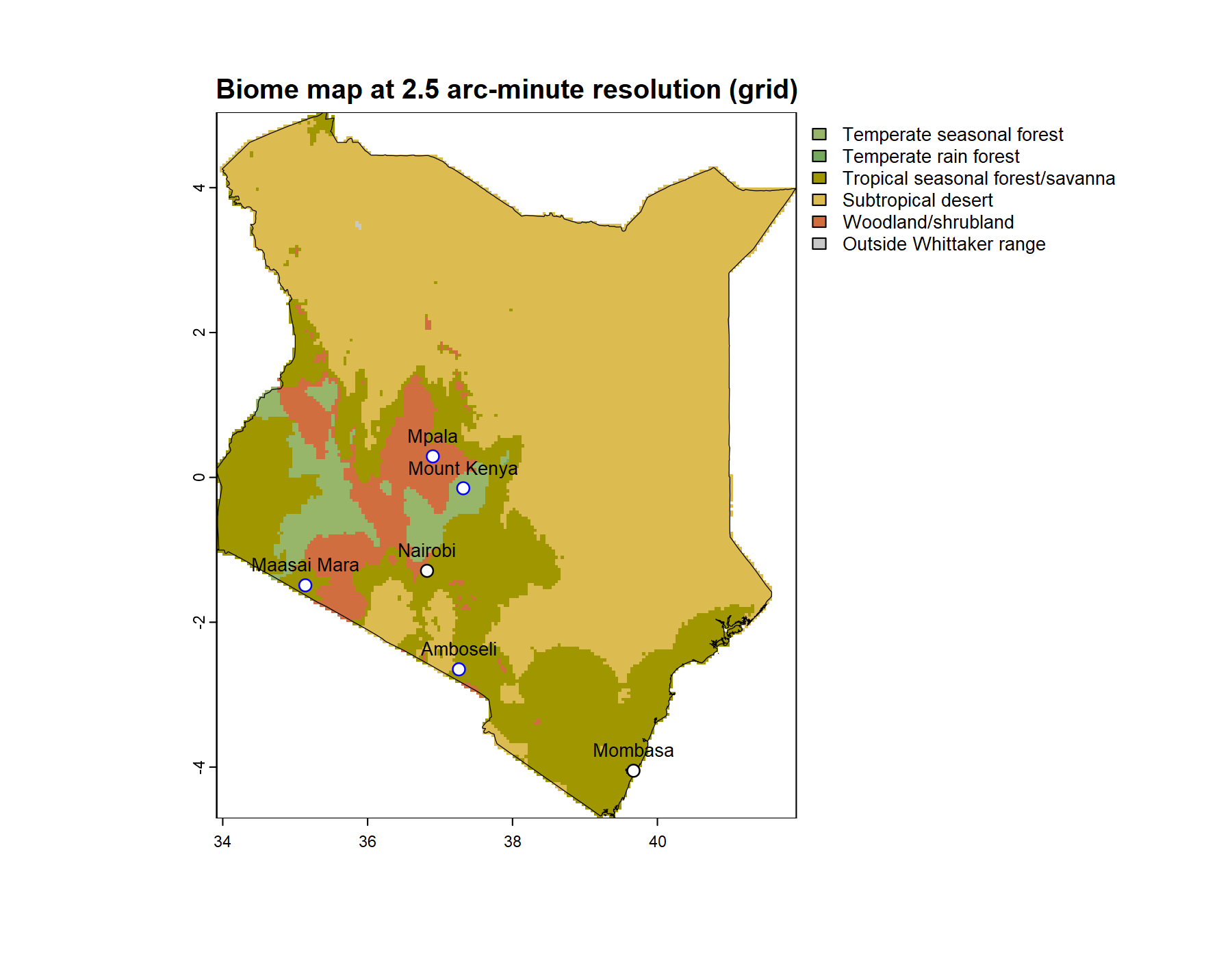
The Kenya map takes anchors of two kinds, and draws them so the two are told apart. The first kind is cities: Nairobi, high in the country near its center, and Mombasa, on the southern coast. The second is conservation land and the science done on it — the Maasai Mara and Amboseli, two of the reserves Kenya is known for; Mount Kenya National Park, on the mountain this chapter returns to later; and the Mpala Research Centre, a working ecological field station in the Laikipia highlands. The two kinds go into one table, with a color column that draws cities in black and the conservation anchors in blue.
Show the code
## the anchor places, in two kinds, each drawn in its own## color: cities in black, conservation land and the field## station in blueanchors <-read_csv("label, lon, lat, color Nairobi, 36.82, -1.29, black Mombasa, 39.67, -4.05, black Maasai Mara, 35.14, -1.49, blue Amboseli, 37.26, -2.65, blue Mount Kenya, 37.32, -0.15, blue Mpala, 36.90, 0.29, blue")## show the anchor tablegt(anchors)
label
lon
lat
color
Nairobi
36.82
-1.29
black
Mombasa
39.67
-4.05
black
Maasai Mara
35.14
-1.49
blue
Amboseli
37.26
-2.65
blue
Mount Kenya
37.32
-0.15
blue
Mpala
36.90
0.29
blue
The table carries the two columns plot_biome_map() requires, lon and lat, and two more it uses when they are present: label, the name to write by each mark, and color, the point color. Passing the table to the points argument draws the anchors; the biomes themselves are named in the map’s legend.
Show the code
## draw the Kenya map with the anchors overlaidplot_biome_map(kenya_map,points = anchors,file ="images/kenya_biomes_anchored.png")
Kenya’s biomes at 2.5-arcminute resolution, with the six anchors. Cities are marked in black, conservation lands and the Mpala field station in blue.
Now the map can be read. Mombasa fixes the hot, humid southern coast; Nairobi, set high in the interior, fixes the cooler central highlands; the Maasai Mara and Amboseli fix the southern grassland and savanna plains; Mpala and Mount Kenya fix the Laikipia highlands and the mountain the country is named for. Follow the six anchors and the colored field resolves into a country with a structure — a warm wet coast, a cool high interior, broad plains across the south, drier land reaching north. The biome each anchor sits in can now be read, named, and questioned.
That last word matters. An anchor is also a check. Anyone who has stood in a place can weigh the biome the map gives it against the heat, the rain, the vegetation they remember; a reader who has only learned that Mombasa is hot and wet can weigh it just as well. The anchors are at once the way into the map and the means of testing it, and the chapter takes up that second use at its end. For now they have told us where the biomes are. They have not told us how much. The next section measures that.
12.3 Measuring the map
The Anchors section read the map as a picture, and asked of it a picture’s question: where is each biome? The same biome_map answers a different kind of question, and answers it as a number rather than a position. How much of Kenya does each biome cover? A picture answers that one badly. The eye is poor at comparing areas, especially the odd, scattered shapes a biome map is made of. It is a question for a measurement.
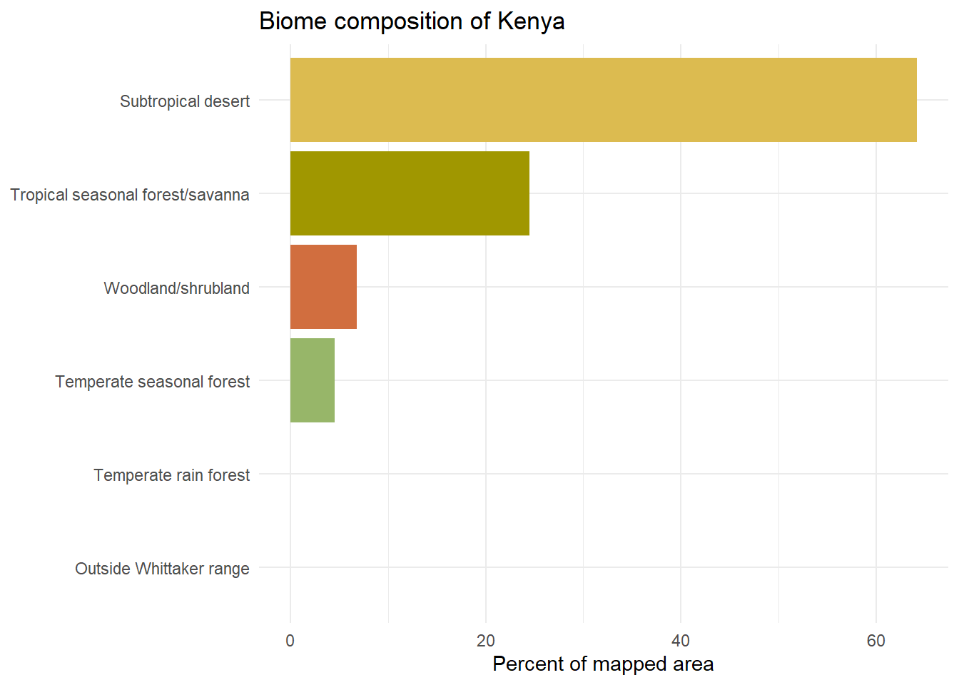
biome_composition() is the measurement. The Retrieving Biome Information chapter already used it once, to give a single retrieved point its regional context — to say whether a point’s biome was the common surround or a rare pocket. Here the same function does something closer to its center of gravity. It describes a whole region in its own right. Given the Kenya map, it returns one row per biome, each with the biome’s mapped area and its share of the country, ranked from the most extensive to the least.
Show the code
## measure the biome composition of the Kenya mapkenya_composition <-biome_composition(kenya_map)## show the measured compositiongt(kenya_composition)
biome
n_cells
area_km2
percent
Subtropical desert
17957
383391.4
64.2
Tropical seasonal forest/savanna
6850
146271.2
24.5
Woodland/shrubland
1888
40340.6
6.8
Temperate seasonal forest
1252
26753.4
4.5
Temperate rain forest
2
42.7
0.0
Outside Whittaker range
4
85.3
0.0
A column of percentages is exact but hard to take in. The same numbers read at a glance as a chart: one horizontal bar per biome, ordered by size, each bar filled with the biome’s own color from the map.
Show the code
## one color per biome, matching the map; the fixed gray is## kept ready in case any land falls outside the Whittaker schemebar_colors <-setNames(biome_palettes$ricklefs, biome_palettes$biome)bar_colors["Outside Whittaker range"] <-"#C8C8C8"## a horizontal bar chart, biomes ordered by their shareggplot(kenya_composition,aes(x = percent, y =reorder(biome, percent), fill = biome)) +geom_col() +scale_fill_manual(values = bar_colors, guide ="none") +labs(x ="Percent of mapped area", y =NULL,title ="Biome composition of Kenya") +theme_minimal()
The chart characterizes Kenya in one view. The longest bars are the dry and seasonal biomes — the arid country of the north and east, the broad savanna belts — and the moist, forested biomes fall well below them. This is worth a pause. The popular picture of Kenya, the one the wildlife films supply, is green plains under flat-topped acacias. The composition corrects it: by area, Kenya is mostly dry country. A careful reading of the map’s colors said as much already; the composition turns the impression into a measurement, and a measurement is harder to wave away.
This is the deeper use of biome_composition(). For a study built on a quantitative question — how much of a country a biome covers, or how that share would move under a projected climate — the ranked breakdown is not an accessory to the map. It is the result. The map shows the country and the composition measures it, and for many purposes the measurement is the product while the picture is only how you reached it.
Reading the map and measuring it have something in common. Both took the map exactly as map_biomes() produced it: a grid of square cells, each holding one biome, their edges meeting at right angles. Neither use minded those edges. The anchors sat on top of them and the measurement counted straight through them. The next section is the first that does mind them. It turns from what the map says to how it looks, and asks whether the blunt square edges of the cell grid can be made to read like the boundaries of a real biome.
12.4 Smoothing the edges
Every biome map in this chapter is a grid of squares. map_biomes() lays a regular grid over a region and classifies each cell; plot_biome_map() fills each cell with its color. Look closely at any of these maps and the staircase shows — biome boundaries run in small right-angled steps, because the cell is the smallest unit the map has, and the cell is square. A real biome boundary is nothing of the kind.
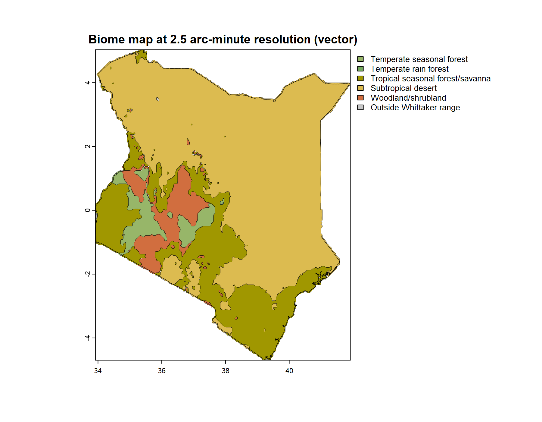
The staircase is not an error. Each cell genuinely holds one climate and one classification, and the hard edge is the map being honest about its own resolution. But it does not read the way a vegetation map reads, where biomes meet along curved and irregular lines. smooth_biome_map() addresses that. It takes a finished biome_map, traces the outline of each biome as a polygon, and rounds those outlines into curves; plot_biome_map() then draws the rounded version when it is asked for render = "vector" in place of the default render = "grid". What smoothing does not touch is the classification. Which biome each cell was assigned does not change — only the line drawn around the result. Smoothing is cosmetic, and honest about being cosmetic: the smoothed map is the same data as the grid map, drawn with a softer pen.
On the Kenya country map the effect is simply good.
Show the code
## add a smoothed boundary representation to the country mapkenya_map <-smooth_biome_map(kenya_map)## draw the smoothed version: render = "vector"plot_biome_map(kenya_map,render ="vector",file ="images/kenya_biomes_smooth.png")
Kenya’s biomes drawn with smoothed boundaries. The classification is identical to the Anchors map; only the boundary lines are redrawn.
Set this beside the gridded map from the Anchors section. The biomes are identical, cell for cell, but the boundaries now curve. At the scale of a whole country each biome covers a broad, many-celled area, so smoothing has long runs of edge to work with, and the curves it draws resemble the boundaries a vegetation map would draw by hand. The map reads better and tells no lies. This is smoothing at its best.
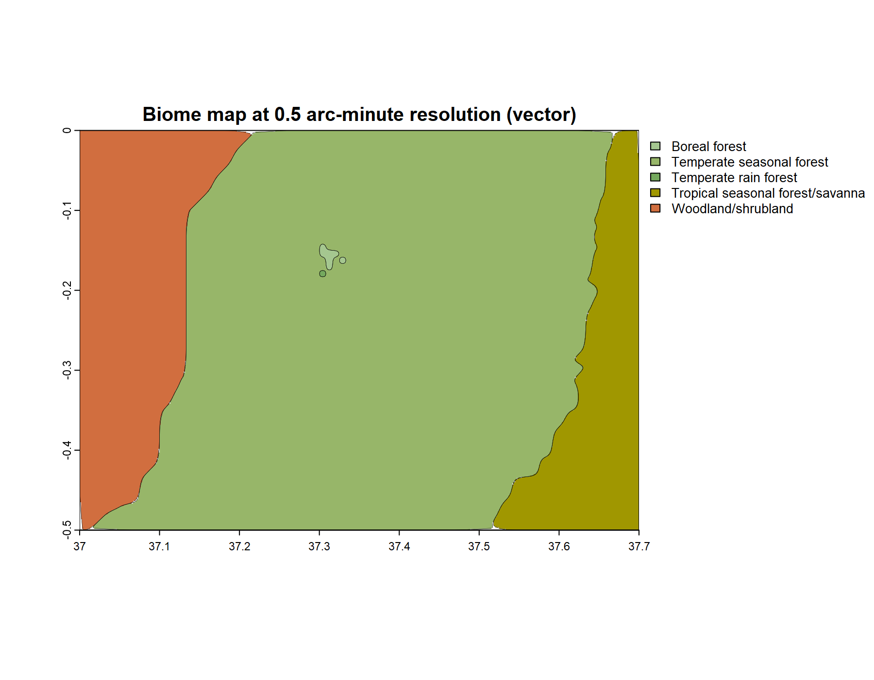
It is not always this benign, and the way to find where it breaks is to change scale. The next map leaves the country behind and zooms onto a single mountain. Mount Kenya stands above 5,000 meters, and a mountain that high carries a cold summit — a small patch of genuinely distinct climate set in the warmer country around it. A small feature is exactly where smoothing is tested. The map takes a bounding box around the massif and classifies it at 30 arc-seconds, the finest resolution WorldClim offers.
Show the code
## a bounding box around the Mount Kenya massifmt_kenya_ext <- terra::ext(37.0, 37.7, -0.5, 0.0)mt_kenya <- terra::vect(mt_kenya_ext, crs ="EPSG:4326")## classify the massif at 30-arcsecond resolution, fine## enough to catch the small, cold summitmt_kenya_map <-map_biomes(region_polygon = mt_kenya,resolution =0.5)
Drawn as map_biomes() produces it, before any smoothing, that is the raw grid.
Show the code
## draw the raw classified gridplot_biome_map(mt_kenya_map,file ="images/mt_kenya_biomes.png")
The Mount Kenya massif at 30-arcsecond resolution, the raw classified grid. A broad montane forest covers most of the frame; the cold summit biomes are the small cluster at its center.
The map is mostly one biome. A broad mantle of cool, wet forest covers the massif, with drier biomes falling away to the west and east as the land loses height and rain. The mountain’s elevation leaves a single mark on the map: at the center, a tiny cluster of cells in the coldest biomes the frame holds — the summit. It is only a handful of cells. At a kilometer to the cell, the peak of a great mountain is barely a smudge, and a coarser map would average it away entirely; 30 arc-seconds is just fine enough to catch it. That smudge is the feature to watch.
Show the code
## smooth the Mount Kenya map and draw the vector versionmt_kenya_map <-smooth_biome_map(mt_kenya_map)plot_biome_map(mt_kenya_map,render ="vector",file ="images/mt_kenya_biomes_smooth.png")
The Mount Kenya map smoothed. The broad boundaries round cleanly; the summit’s lone cells have become small circles — an artifact of the method, not the shape of anything real.
Smoothing treats the map’s two kinds of feature very differently. The broad boundaries — the montane forest against its drier flanks — round as cleanly as the country map’s did; there is plenty of edge to work with. The summit is another matter. Its outlying cells, the ones that stood alone, have become small circles. The reason is the one the country map could not show: smoothing rounds the corners of every outline, and a lone cell is a square of four corners with nothing between them, so its four rounded corners close into a circle.
It is worth being exact about what is wrong with that circle. The summit biomes are real — Mount Kenya genuinely carries a cold cap, and the classification did not invent it. What smoothing got wrong is the shape. No summit’s vegetation is a tidy round disk. The grid had drawn those cells as blunt squares, plainly the limit of the map’s resolution; smoothing redrew them as clean circles, and a clean circle looks deliberate, looks like a measured shape rather than a single pixel. And a circle is exactly what smoothing also makes of a lone cell that is nothing but classification noise. Once smoothed, the real tiny feature and the spurious one are identical — two confident little disks. The data did not change. What changed is that the reader can no longer tell signal from noise at the smallest scale.
So smoothing is a rendering choice, and the right choice depends on the scale of the features. Where biomes cover broad, many-celled areas, as on the country map, smoothing has real boundaries to round and renders them faithfully. Where what matters is small — a summit, a pocket, a single cell of either truth or noise — smoothing rounds it into a shape it does not have. The toolkit offers both renderings and leaves the choice to the map-maker. The rule is the plain one: smooth when the features are broad, and show the grid when they are not.
That rule points past itself. The Mount Kenya circles are a small instance of a large hazard — a map can be drawn so that it looks more certain, and more deliberate, than it is. How far a biome map should be trusted is the question this chapter has been circling, and it is where the chapter ends.
12.5 An argument, not a fact
This chapter has put a single biome map of Kenya to work three ways. It anchored the map to known places, measured the country’s composition from it, and smoothed its edges — and on Mount Kenya it watched smoothing turn a handful of uncertain cells into deliberate-looking shapes. Each of those steps was useful. Each was also a choice, and the Mount Kenya circles were a plain warning that a map’s choices can leave it looking more certain than it has any right to be. One question is left, the one the chapter has been circling from its first page: how far should a biome map be believed?
The honest answer begins by saying what the map is not. It is not a fact. A fact does not change when you change how you look at it; this map does. Choose a coarser resolution and the cold summit averages away; choose a different palette and a different biome leaps out of the page; choose to smooth and a single cell becomes a circle. Under all of those choices sits a deeper one: the Whittaker scheme itself, the nine polygons, was one ecologist’s proposal, drawn by hand. The map applies that proposal to climate data exactly and reproducibly — that is what makes it objective — but applying a proposal exactly does not make the proposal true. A biome map is an argument: a claim about the world, assembled from data and from choices, every one of them on view.
That is the map’s strength, not its weakness. A fact is something you accept; an argument is something you can examine. Every input to one of these maps is explicit and every step reproducible — the climate source, the Whittaker polygons, the resolution, the smoothing. Anyone can run it, change a single choice, and see exactly what moves. A map you can interrogate is worth more than a map you must take on trust, because the first can be checked and the second can only be believed.
And the chapter has already shown where the checking is done. It is done at the anchors. An anchor is a place a reader knows, or can come to know, and the biome the map assigns it is a claim that can be tested — against the literature, against a vegetation map, against the memory of having stood there. Where two such checks agree the claim is firm; where they disagree, something has been found. The anchors were the chapter’s way into the map. They are equally its way of arguing back.
One check, though, the map cannot arrange for itself, and it is the most telling of all. The classifier reads two numbers, temperature and precipitation. It never sees the shape of the land. Yet on a mountain the biomes ought to follow the terrain — the cold cap where the ground stands highest, the warmer biomes where it falls away. Whether they do is something a flat map cannot show, because on a flat map the terrain is not there to check against. The next chapter puts it there. It drapes these biome maps over the real, three-dimensional Earth and asks whether a classification that never saw a mountain has nonetheless drawn one.