The climate chapter produced climate numbers: an annual mean temperature and an annual precipitation for a place. This chapter turns those numbers into a picture. The Whittaker diagram plots temperature against precipitation and divides the result into biomes, and plot_biomes() is the function that draws it. Called with no data, it draws the diagram by itself. Given climate values, it places points on the diagram, so that a site’s climate becomes a position and the position falls within a biome.
The Whittaker diagram is the object this document is built around. The conceptual chapters explained it, the climate chapter fed it, and the mapping chapters will extend it across geographic space. This chapter is where it finally gets drawn.
6.1 Setup
Every code-bearing chapter begins with a setup chunk. Run it first.
Show the code
## the whittakerr toolkit: get_climate(), plot_biomes()library(whittakerr)## ggplot2 underlies the diagram that plot_biomes() drawslibrary(ggplot2)## read_csv() for reading inline and file-based data tableslibrary(readr)## filter() for selecting the California gardenslibrary(dplyr)## suppress read_csv() column-type messages for the whole chapteroptions(readr.show_col_types =FALSE)
6.2 The biome diagram
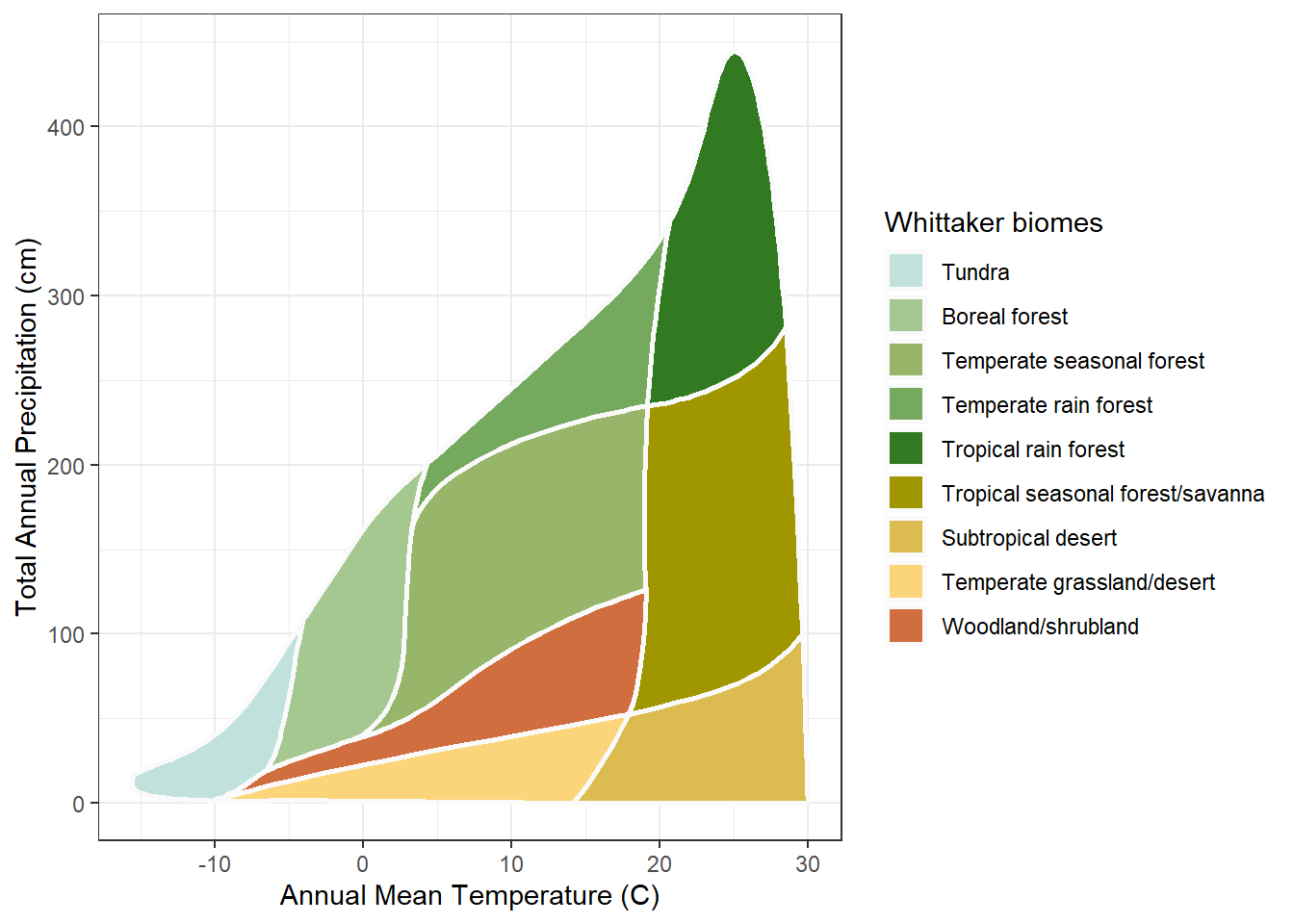
Call plot_biomes() with no arguments and it draws the diagram on its own:
Show the code
## draw the Whittaker biome diagram with no data addedplot_biomes()
The horizontal axis is annual mean temperature, in degrees Celsius, cold on the left and hot on the right. The vertical axis is annual precipitation, in centimeters, dry at the bottom and wet at the top. Every place on Earth has a temperature and a precipitation, so every place is a point somewhere in this space. The colored regions are the nine biomes, each one the part of climate space where that biome is found. A point’s biome is the region it lands in, and nothing more.
The colors come from a built-in palette. They are not arbitrary: greens for forests, tans and yellows for arid biomes, light blues and grays for cold types, a convention that makes the diagram resemble the landscape it describes. The next chapter, Color, treats palette design, customization, and color-vision accessibility in full. Here the default palette is used throughout.
plot_biomes() returns an ordinary ggplot object. Printing it draws the diagram, as just shown; it can equally be saved to a variable, passed to ggsave() to write an image file, or extended with further ggplot2 layers.
6.3 Placing one site
A climate value is a temperature and a precipitation, which is to say a point. Retrieve the climate for one place, with get_climate() as the climate chapter showed, and hand the two numbers to plot_biomes(). Here is Honolulu, the running example:
Show the code
## retrieve Honolulu's climatehonolulu <-get_climate(lon =-157.86, lat =21.31)## place Honolulu on the diagramplot_biomes(mean_temp_c = honolulu$mat_c,total_ppt_cm = honolulu$map_cm)
The point sits where Honolulu’s temperature and precipitation put it, and the biome region containing it is Honolulu’s biome. The two arguments are mean_temp_c and total_ppt_cm; get_climate() returns its values as mat_c and map_cm, so the climate columns feed straight in. Reading the biome off the diagram is a visual act: find the point, see its region. A later chapter does the same thing in code, with name_biome() returning the biome name as a value.
6.4 Several sites at once
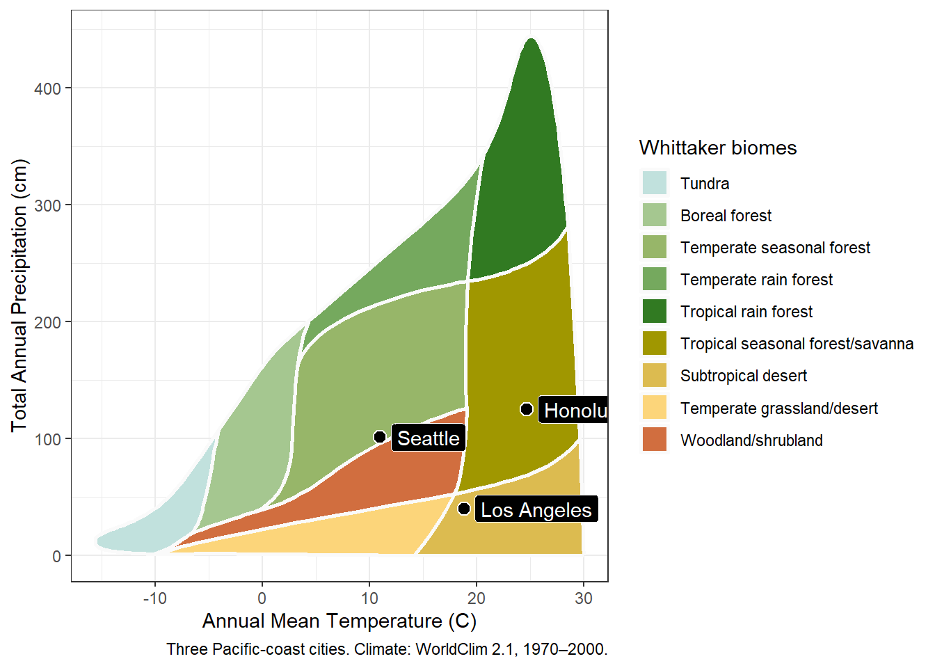
plot_biomes() accepts vectors. Pass a vector of temperatures and a matching vector of precipitations, and it places every point on one diagram. The three Pacific-coast cities from the climate chapter make the case well, because their climates are so different.
Build them as an inline table, one row per city:
Show the code
## three Pacific-coast cities as an inline data tablecities <-read_csv("name, lon, lat Honolulu, -157.86, 21.31 Los Angeles, -118.24, 34.05 Seattle, -122.33, 47.61")
Retrieve their climate in one call, then place all three on the diagram:
Show the code
## retrieve climate for all three citiescities_climate <-get_climate(lon = cities$lon, lat = cities$lat)
Show the code
## place all three cities on the diagramplot_biomes(mean_temp_c = cities_climate$mat_c,total_ppt_cm = cities_climate$map_cm)
Three points, three different parts of the diagram. The wide climate range noted in the climate chapter is now something you can see: a warm wet city, a mild dry one, and a cool wet one do not share a region.
6.5 Labels and a caption
The three points show position but not identity. The label argument names them, and the source argument adds a caption beneath the plot:
Show the code
## place the cities, now with labels and a captionplot_biomes(mean_temp_c = cities_climate$mat_c,total_ppt_cm = cities_climate$map_cm,label = cities$name,source ="Three Pacific-coast cities. Climate: WorldClim 2.1, 1970–2000.")
The label vector lines up with the point vectors row for row, so the names must be in the same order as the climate values. Both come from the cities table in its original row order, so they align. The caption records the figure’s data source, the same source-citation discipline the data tables follow.
6.6 A larger example: the California gardens
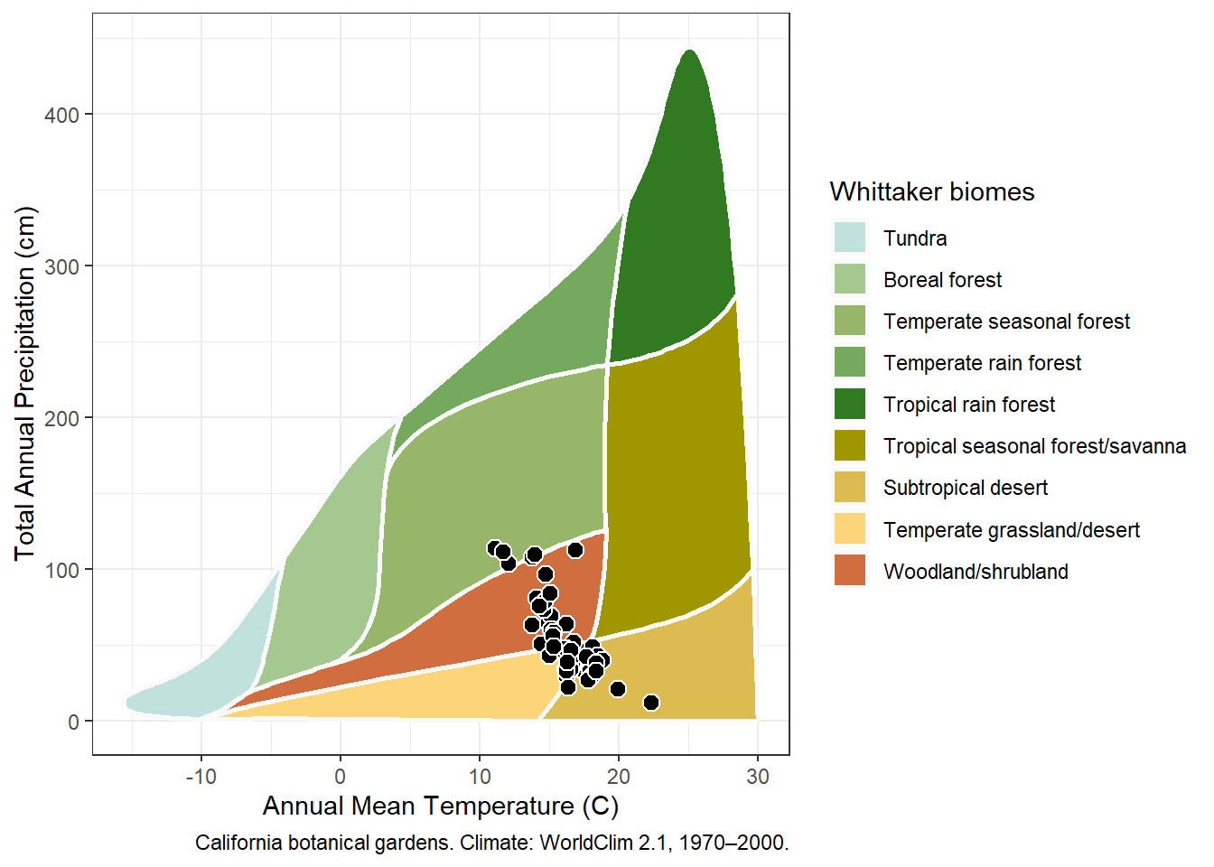
Labels suit a handful of points. A larger set is placed the same way, just without labels, since dozens of overlapping labels would be unreadable. The California botanical gardens from the climate chapter are a good test, retrieved and plotted in the same few steps.
Show the code
## locate the botanical-gardens file bundled with whittakerrgardens_file <-system.file("extdata", "Bot_Garden_Geocode_CSV.csv",package ="whittakerr")## the gardens CSV is in Windows-1252, a legacy Windows## encoding; read_csv() assumes UTF-8 unless told otherwisegardens <-read_csv(gardens_file,locale =locale(encoding ="Windows-1252"))
Show the code
## keep only the California gardensca_gardens <-filter(gardens, State =="CA")## retrieve their climateca_climate <-get_climate(lon = ca_gardens$lon, lat = ca_gardens$lat)
Show the code
## place every California garden on the diagramplot_biomes(mean_temp_c = ca_climate$mat_c,total_ppt_cm = ca_climate$map_cm,source ="California botanical gardens. Climate: WorldClim 2.1, 1970–2000.")
The cloud of points is the result worth studying. The gardens do not scatter evenly: they fall across several biomes rather than one, and they bunch where temperate and Mediterranean climates put them. A reader could not find that pattern in a table of 65 rows. Seeing the pattern is what the diagram is for.
6.7 The data behind the diagram
plot_biomes() is a convenience wrapper, not the only way to draw the diagram. Its two ingredients are both bundled package datasets: Whittaker_biomes, the polygon boundaries of the nine biome regions, and Ricklefs_colors, the palette. Anyone who wants a diagram the function does not produce, whether a different projection, a different rendering, or a custom layer, has the raw material directly.
That openness answers a fair question to ask of any plotting function: can you get at what it draws? Here you can. The Color chapter uses exactly that openness, reaching past the default palette to build and compare alternatives.