1 Where the Map Stopped
Here’s a map of a small piece of Hawaiʻi Volcanoes National Park, about three kilometers across. It’s built from twelve points. At each one, someone could stand and record the vegetation. Around each point is a tile, and the tile holds every place that’s closer to that point than to any other. Color the tiles by vegetation type and the map is done.
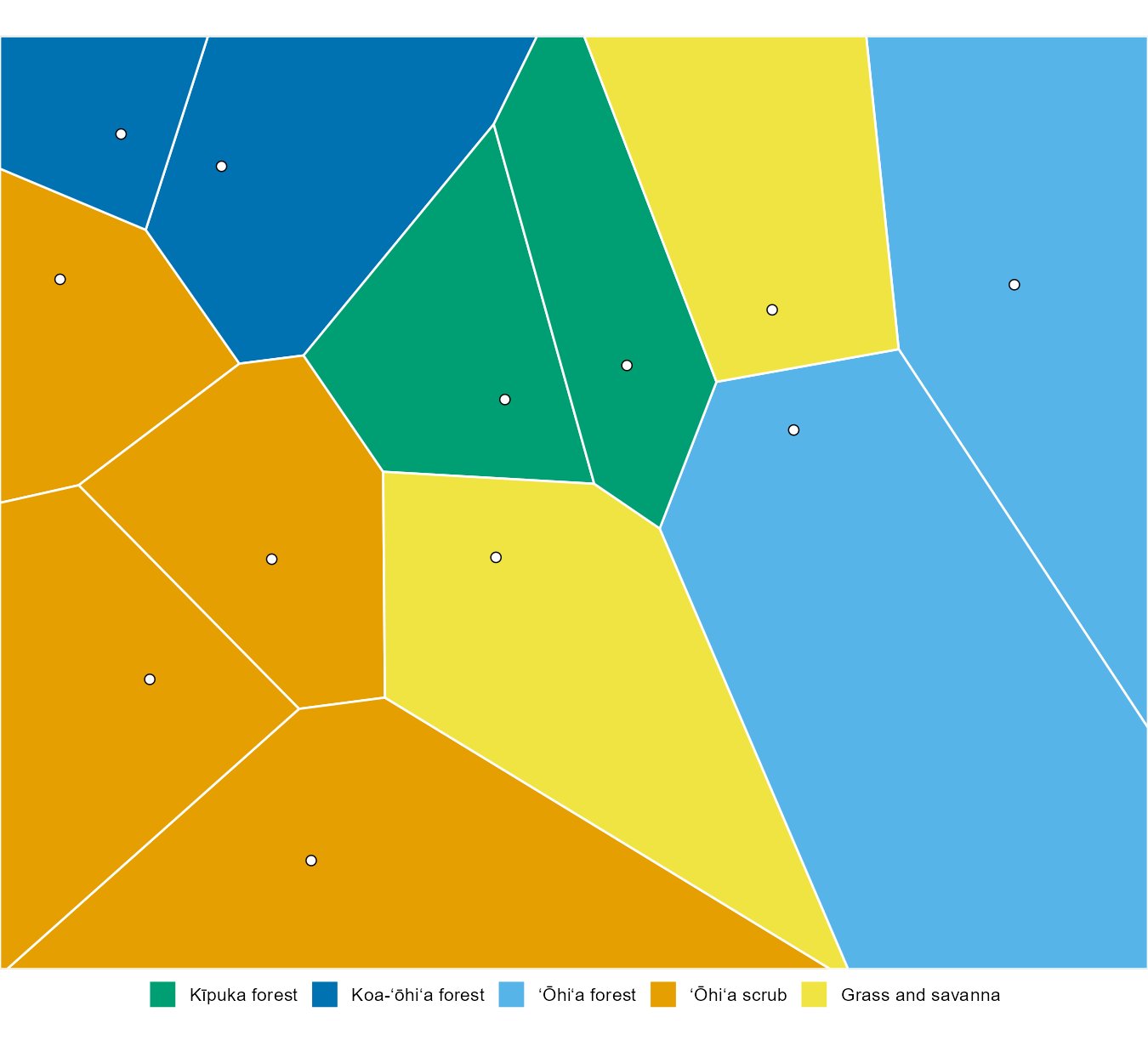
It took a few lines of R and less than a second to draw. Anyone with the same twelve points would draw exactly the same map.
Here’s another map of the same ground.
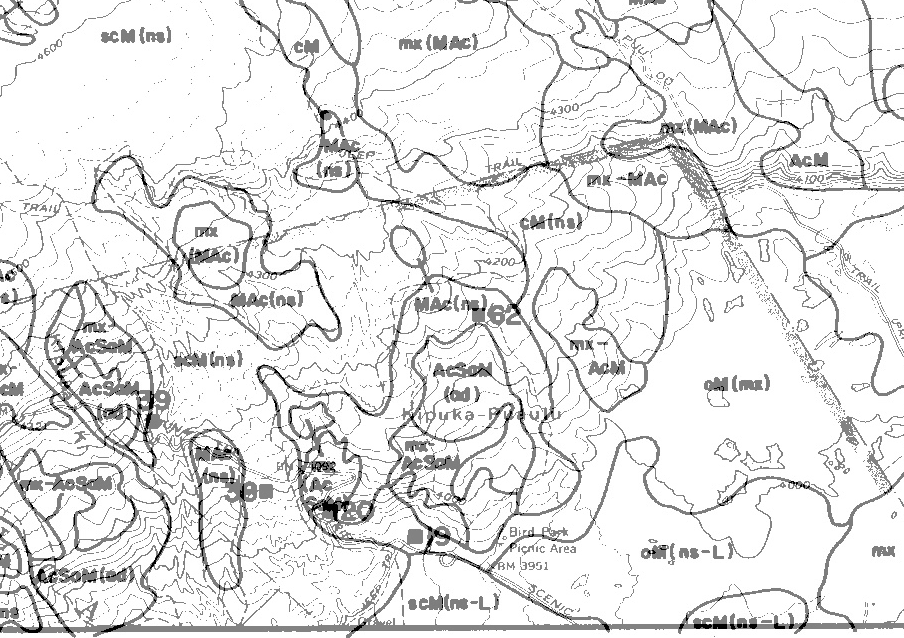
F. Raymond Fosberg drew its boundaries from air photographs taken in 1954, working indoors from years of field knowledge. Dieter Mueller-Dombois checked them on the ground in 1965 and adjusted them. Then Tomatsu Nakata traced every line by hand onto the topographic map sheets. The lines wander. They follow the edge of the kīpuka, loop around small stands of trees, and run along the lava flows. Nothing about them is straight.
Put the two maps next to each other and a question asks itself. Can Voronoi tessellations make maps with the border complexity of hand-drawn vegetation maps?
I’m not going to answer that here. Hold on to it. It’s the reason for everything that follows.
1.1 How I got here
For years I watched colleagues who were vegetation scientists spend a lot of time doing fieldwork. I often helped them with the analysis of their data. The analysis usually went well. Where progress seemed to stop was the production of a map.
At first it was a limitation in drawing. We invested in a cartographer’s tools: materials for scribing, ruby-pointed scribes, and all the complexity of a darkroom with a large-format camera. It didn’t really get us anywhere. Those were the analog days, and the learning curve was too steep to master on the side of everything else.
Digital technology looked like the way out. Pen plotters showed a real possibility. But the software held us back, just as the analog tools had.
Then, out of the blue, I ran across an article describing Voronoi tessellations. It was published in 1984, and the reprint is still in my separates library. And there was code to be had, so it could be implemented. But the code was in the wrong language for the time. If memory serves, it was FORTRAN, and I spent many hours trying to convert it to BASIC. I never quite got it finished. My interests and responsibilities changed, and it became another interesting project that stayed on a shelf.
It was only years later that I ran across a useful implementation. All those memories of how this would have helped, back in the day, came back to me.
1.2 The 1984 article
The article was by David Arnold and Wendy Milne, computer scientists at the University of East Anglia: “The Use of Voronoi Tessellations in Processing Soil Survey Results,” in the March 1984 issue of IEEE Computer Graphics and Applications (Arnold and Milne 1984).
Their problem was the Greek soil survey. Surveyors sampled the soil every 50 to 200 meters, about 5,000 points for a single map sheet. A cartographer then drew boundaries around groups of points with the same classification. Arnold and Milne saw what that cartographer was really doing:
Each point, therefore, defines a sphere of influence. If sample points are assumed to be of equal significance, it is reasonable to assume that the sphere of influence of any point is the area closest to that point.
That’s a Voronoi tessellation, drawn by hand. So they built one by computer. On a test area of 656 survey points they produced 1,969 tile edges, then merged neighboring tiles with the same soil type into 54 polygons of 14 soil types. They also noticed two ways the hand-drawn map went wrong. The large map symbols sat to the right of their points, which quietly pulled boundaries in that direction. And small differences between neighboring samples were smoothed away to make the map look cleaner.
The friction is all there in the paper too. They entered points on a digitizing tablet. They checked them on a Benson pen plotter. They filled the tiles on a Grinnell frame buffer and photographed the screen. A colleague had to implement the tessellation algorithm from a paper by Green and Sibson. It worked, but it took a computing department.
The paper appeared in a computer graphics journal, not a soils or an ecology journal. That may be part of why I didn’t see the method taken up in vegetation mapping. I’ll put it carefully: I didn’t see it. That’s not the same as saying nobody used it.
And somebody did. Another reprint in my files, from 1996, shows it. Carol Johnston and her colleagues at the University of Minnesota (Johnston et al. 1996) sampled a 2.9 hectare wetland along the Pokegama River in Wisconsin at 81 points. They classified the points into seven plant communities, drew a Thiessen polygon around each point, and merged neighbors of the same community. They were candid about the result. The map “appeared somewhat blocky,” and the polygons were “not necessarily representative of the true spatial extent of vegetation types, particularly in areas where sample points are widely spaced.” That’s the question at the top of this chapter, seen from a wetland in Wisconsin. They also compared their tiles with a map made from airborne video, and that comparison comes back in a later chapter.
1.3 The friction is gone
What stopped us then was the drawing, the computing, and getting the result out to a device you could use. All three are gone now. A tessellation of thousands of points takes a moment on a laptop. The map goes to a screen, a web page or a printer without anyone scribing a line.
Johnston’s group points to a fourth kind of friction: knowing exactly where each point is. “Constructing a map from point data requires collection of locational as well as floristic data,” they wrote, “a fact often overlooked by field ecologists.” In 1993 that meant a differential GPS on a backpack frame, with a base station, a radio link and two 12-volt batteries in a wooden box.
Before GPS it was worse. If you were deep in the vegetation of Kīpuka Puaulu, how would you know where you were? You had to remember to set your barometric altimeter at the base station each morning. Then you tried to find your location on a topo sheet. Even with the best of intentions, locations were pretty inaccurate, except when they were near roads or similar structures you could see on the map. It was a lot of friction, and every map drawn from those points inherited it.
Today a phone in your pocket comes close to what Johnston’s backpack did.
Something else has changed too. There are now kinds of data that Arnold and Milne and my colleagues didn’t have. One of them, a map of canopy height covering almost every forest on earth, turns out to matter a great deal for the question above. That’s for a later chapter.
So it’s time to test the old instinct. Are Voronoi tessellations useful in the research fields I inhabit? Vegetation science first, then ethnobotany, ecology, botany, geography and public health. Each chapter tests part of the answer, and the last chapter gives it.
The map that never got drawn can be drawn now. Whether it’s worth drawing is what this document is for.