The same twelve points can make several different maps. What changes is not the tiles. It’s what the points carry, and what you do with tiles whose points carry the same thing.
Three cases cover most of what people do. Every point stands for itself. Every point has its own name. Or some points share a category, and the tiles that share it can be merged. This chapter works through them with the Kīpuka Puaulu points, and then looks at a choice that every map of the third kind has to make: show the tiles, or show the merged patches.
Show the code
## --- Standard packages ---## many useful functions, including read_csv() and ggplot()library(tidyverse)## formatted tableslibrary(gt)## --- Specialized packages ---## spatial data: points, polygons, and the Voronoi functionlibrary(sf)## --- Options and defaults ---## suppress read_csv() column-type messagesoptions(readr.show_col_types =FALSE)## the vegetation colors used throughout the document (Okabe-Ito palette)veg_colors <-c("Kīpuka forest"="#009E73","Koa-ʻōhiʻa forest"="#0072B2","ʻŌhiʻa forest"="#56B4E9","ʻŌhiʻa scrub"="#E69F00","Grass and savanna"="#F0E442")## the twelve sample points, in UTM zone 5Nreleves <-read_csv("data/kipuka_puaulu_releves.csv")releve_points <-st_as_sf(releves, coords =c("easting", "northing"), crs =32605)## the study area rectanglearea_corners <-read_csv("data/kipuka_puaulu_study_area.csv")study_box <-st_bbox(c(xmin = area_corners$easting[1],ymin = area_corners$northing[1],xmax = area_corners$easting[2],ymax = area_corners$northing[2]),crs =st_crs(32605))study_area <-st_as_sfc(study_box)
Show the code
## the three tile-building steps from Chapter 2, as a functionmake_tiles <-function(points, frame) {## build the tiles around all the points tiles_all <-st_voronoi(st_union(points), envelope = frame)## split the result into separate polygons tiles <-st_collection_extract(tiles_all)## trim the tiles to the frame tiles <-st_intersection(tiles, frame)## attach each tile to the point inside it tiles <-st_sf(geometry = tiles)st_join(tiles, points)}## the tiles used throughout this chapterreleve_tiles <-make_tiles(releve_points, study_area)
4.1 Every point stands for itself
Suppose the twelve points were insect traps instead of vegetation samples. Every trap is the same kind of thing, so there’s no category to color. What you want to know is how much ground each trap is watching. The tiles answer that directly. Each trap watches the area closer to it than to any other trap.
Show the code
## the area each point stands for, in hectarestrap_areas <-tibble(point = releve_tiles$releve,area_ha =round(as.numeric(st_area(releve_tiles)) /10000, 1))trap_areas <-arrange(trap_areas, desc(area_ha))## show ittrap_areas |>gt() |>tab_header(title ="Area each point stands for")
Area each point stands for
point
area_ha
R05
159.2
R04
101.2
R03
94.2
R12
88.9
R06
63.2
R10
62.0
R08
60.4
R02
51.8
R11
44.8
R09
44.0
R07
39.0
R01
23.1
The largest tile is about 7 times the size of the smallest. If these were traps, a catch from the largest tile would stand for far more ground than a catch from the smallest, and a fair comparison would have to allow for it. That’s the first use of a Voronoi map. It shares the ground out among the points and tells you each point’s share.
4.2 Every point has its own name
Now give each point a name of its own: a school, a market, a weather station. The map is the same set of tiles, but each tile is now a district with an identity. Every place in the study area belongs to exactly one of them.
Show the code
## draw the tiles with their namesggplot() +geom_sf(data = releve_tiles, fill ="grey93", color ="grey35", linewidth =0.5) +geom_sf(data = releve_points, size =2) +geom_sf_text(data = releve_points, aes(label = releve), nudge_y =90, size =4) +coord_sf(datum =NA, expand =FALSE) +theme_void(base_size =13)
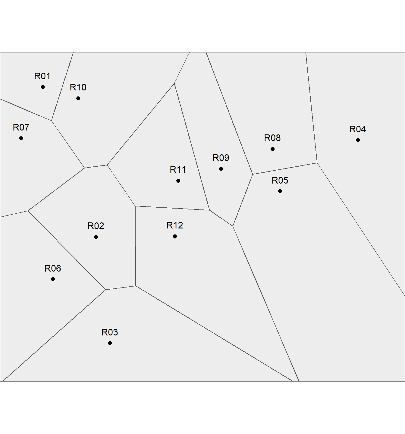
One tile per point, each labeled with its point’s name. Each tile is a district.
Climate zones are sometimes drawn this way, with each weather station claiming the land nearest to it. So are school districts and service areas. The map works because the question is exactly the one it answers: which named point is nearest?
4.3 Some points share a category
Vegetation samples are different. The twelve points fall into only five vegetation types, so several tiles carry the same type. Where two tiles of the same type touch, the line between them doesn’t mean anything. Both sides are the same vegetation. So the natural next step is to remove those lines and merge neighboring tiles of the same type into one patch.
Arnold and Milne (1984) did exactly this. Their 656 soil samples made 1,969 tile edges, and merging tiles of the same soil type reduced the map to 54 polygons. Johnston and her colleagues (1996) did the same for their wetland, dissolving the boundaries between tiles of the same plant community.
Show the code
## merge tiles that share a vegetation typemerged <-group_by(releve_tiles, vegetation)merged <-summarise(merged, tiles =n())## a merged type can still be in separate pieces; split each type into its patchespatches <-st_cast(st_cast(merged, "MULTIPOLYGON"), "POLYGON")## how many sample points sit inside each patch?patches <-mutate(patches,points =lengths(st_intersects(geometry, releve_points)),area_ha =round(as.numeric(st_area(geometry)) /10000, 1))## show the patchespatches |>st_drop_geometry() |>select(vegetation, points, area_ha) |>arrange(vegetation, desc(area_ha)) |>gt() |>cols_label(vegetation ="Vegetation type",points ="Sample points in the patch",area_ha ="Area (ha)") |>tab_header(title ="Patches after merging")
Patches after merging
Vegetation type
Sample points in the patch
Area (ha)
Grass and savanna
1
88.9
Grass and savanna
1
60.4
Koa-ʻōhiʻa forest
2
85.1
Kīpuka forest
2
88.8
ʻŌhiʻa forest
2
260.5
ʻŌhiʻa scrub
4
248.3
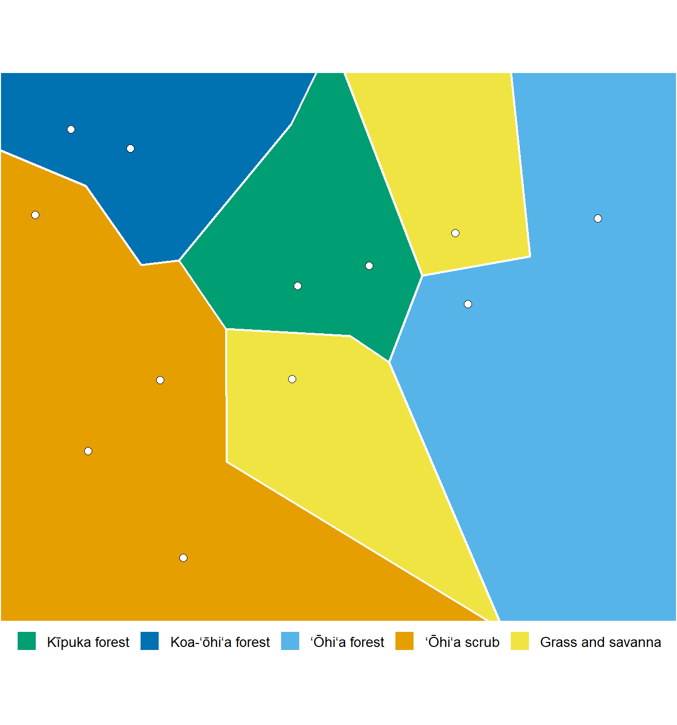
Twelve tiles become 6 patches. And 2 of those patches rest on a single sample point.
Show the code
## draw the merged patchesggplot() +geom_sf(data = patches, aes(fill = vegetation), color ="white", linewidth =0.8) +geom_sf(data = releve_points, shape =21, fill ="white", color ="black", size =2.4) +scale_fill_manual(values = veg_colors, breaks =names(veg_colors), name =NULL) +coord_sf(datum =NA, expand =FALSE) +theme_void(base_size =13) +theme(legend.position ="bottom")
The same tiles after merging neighbors of the same vegetation type. Lines remain only where the vegetation changes.
The merged map looks much more like a vegetation map. That’s its strength, and it’s also something to be careful about.
4.4 Raw tiles or merged patches
The two versions show different things.
Raw tiles show the evidence. Every tile is one sample. A small tile means the samples were close together there. A large tile means one sample is standing in for a lot of ground. You can see at a glance where the map is well supported and where it’s stretched thin.
Merged patches show the pattern. They answer the question a vegetation map is meant to answer: where is each type? But they hide the evidence. A patch built from one sample looks just as solid as a patch built from thirty.
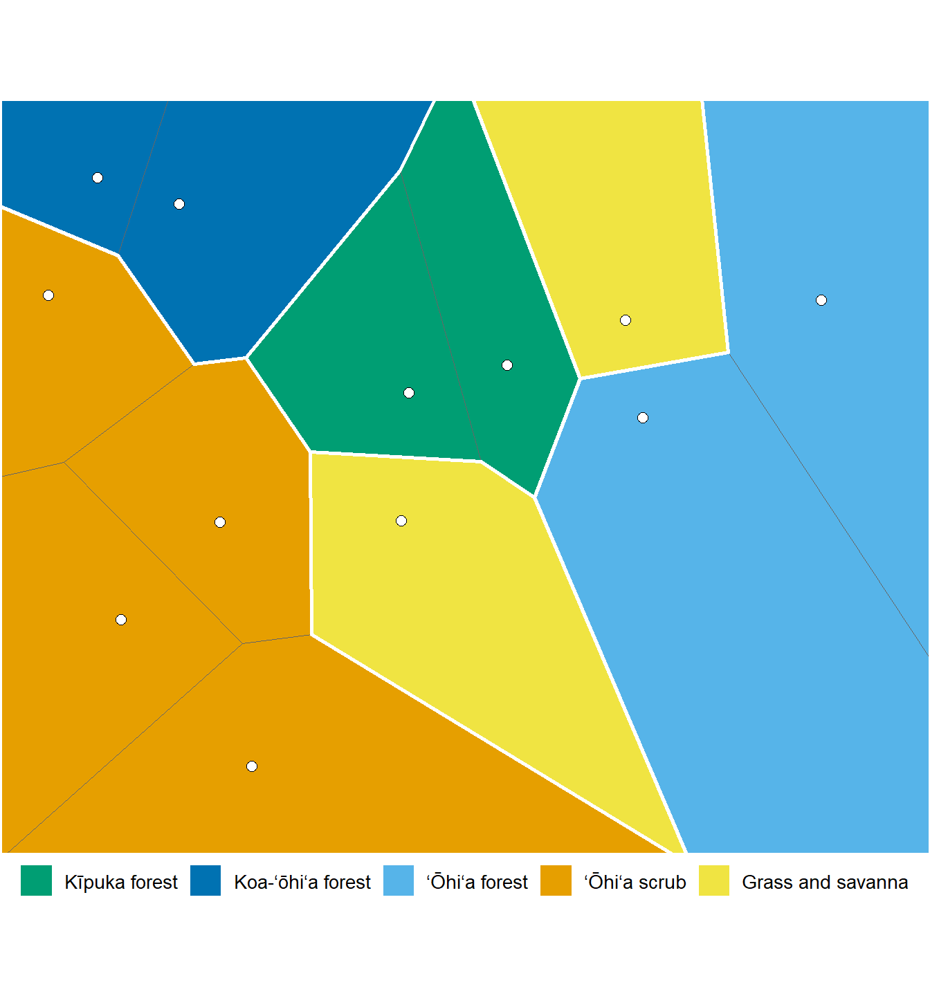
Neither is wrong. They answer different questions. One simple way to keep both is to color the merged patches and draw the raw tile edges lightly on top. The reader sees the pattern first and the evidence underneath.
Show the code
## draw the merged patches, then the raw tile edges on topggplot() +geom_sf(data = patches, aes(fill = vegetation), color =NA) +geom_sf(data = releve_tiles, fill =NA, color ="grey40", linewidth =0.25) +geom_sf(data = patches, fill =NA, color ="white", linewidth =0.9) +geom_sf(data = releve_points, shape =21, fill ="white", color ="black", size =2.4) +scale_fill_manual(values = veg_colors, breaks =names(veg_colors), name =NULL) +coord_sf(datum =NA, expand =FALSE) +theme_void(base_size =13) +theme(legend.position ="bottom")
Merged patches (color) with the raw tile edges drawn lightly on top (thin grey lines). The pattern and the evidence in one map.
4.5 Merging at a coarser level
Arnold and Milne made one more point that’s easy to pass over. Tiles don’t have to be merged only when their categories are identical. “Amalgamation criteria other than equality could be used,” they wrote, “if they would result in a more useful map.”
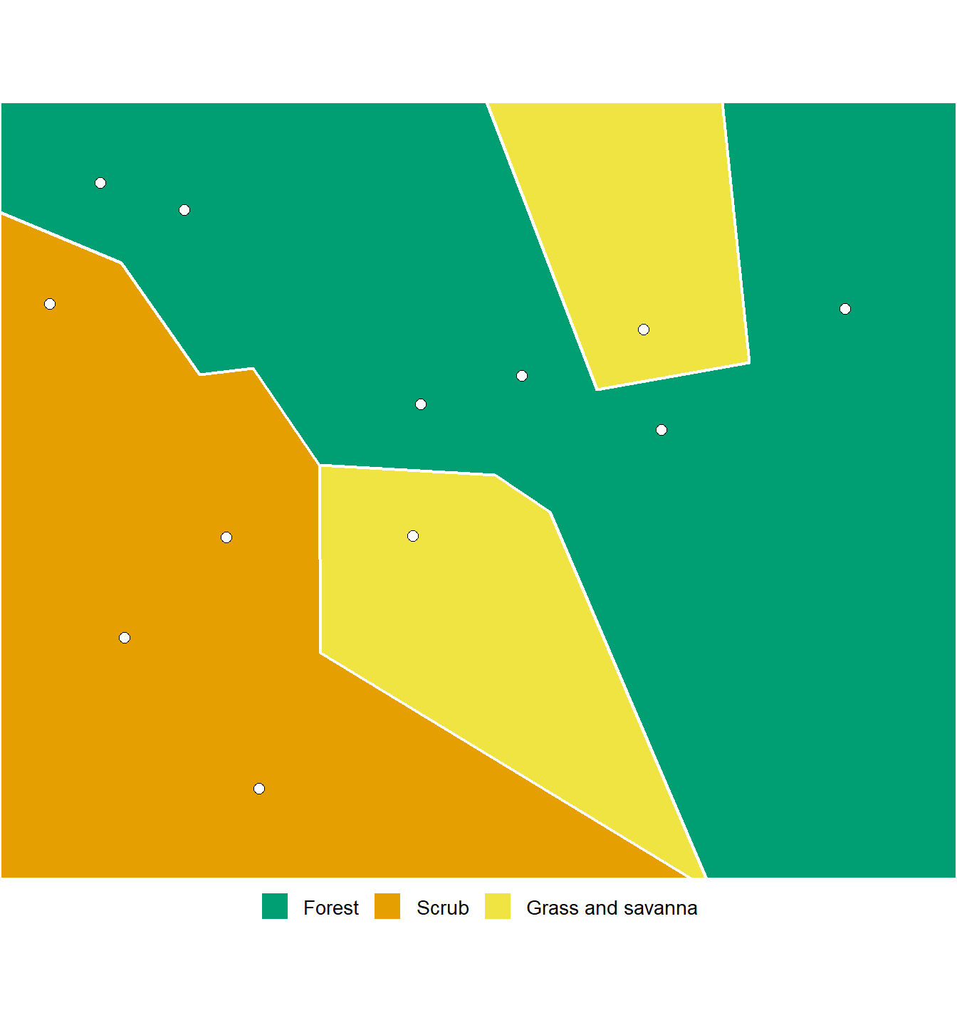
Vegetation classifications are usually built in levels. Here the three forest types can be grouped as forest, with scrub and grassland beside them. Merge at that level and the same twelve tiles give a simpler map.
Show the code
## a coarser grouping of the five vegetation typesgroup_table <-read_csv(file ="vegetation, group Kīpuka forest, Forest Koa-ʻōhiʻa forest, Forest ʻŌhiʻa forest, Forest ʻŌhiʻa scrub, Scrub Grass and savanna, Grass and savanna")## show the groupinggroup_table |>gt() |>tab_header(title ="Grouping the vegetation types")
Grouping the vegetation types
vegetation
group
Kīpuka forest
Forest
Koa-ʻōhiʻa forest
Forest
ʻŌhiʻa forest
Forest
ʻŌhiʻa scrub
Scrub
Grass and savanna
Grass and savanna
The same tiles merged at a coarser level: the three forest types grouped as forest.
Show the code
## attach the group to each tile and merge by grouptiles_grouped <-left_join(releve_tiles, group_table, by ="vegetation")merged_groups <-group_by(tiles_grouped, group)merged_groups <-summarise(merged_groups, tiles =n())## colors for the three groups, taken from the vegetation colorsgroup_colors <-c("Forest"="#009E73","Scrub"="#E69F00","Grass and savanna"="#F0E442")## draw the coarser mapggplot() +geom_sf(data = merged_groups, aes(fill = group), color ="white", linewidth =0.8) +geom_sf(data = releve_points, shape =21, fill ="white", color ="black", size =2.4) +scale_fill_manual(values = group_colors, breaks =names(group_colors), name =NULL) +coord_sf(datum =NA, expand =FALSE) +theme_void(base_size =13) +theme(legend.position ="bottom")
The same tiles merged at a coarser level: the three forest types grouped as forest.
The tiles didn’t change. Only the classification did, and the map followed it. The same is true of any classification with levels, whether it comes from a vegetation scientist’s table or from the names people use for the plant communities around them.
NoteUseful?
One tile per point: yes, whenever the question is “how much ground does each point stand for?” or “which point is nearest?” Traps, stations, schools and service areas all fit.
Merged patches: yes, and they look like a vegetation map. But show the raw tile edges or the number of samples behind each patch, so a patch resting on one sample isn’t mistaken for a well-supported one.
Merged patches show the pattern. Raw tiles show the evidence.
Arnold, D. B., and W. J. Milne. 1984. “The Use of Voronoi Tessellations in Processing Soil Survey Results.”IEEE Computer Graphics and Applications 4 (3): 22–28.
Johnston, Carol A., Carol A. Sersland, John Bonde, Deb Pomroy-Petry, and Paul Meysembourg. 1996. “Constructing Detailed Vegetation Databases from Field Data and Airborne Videography.” In Proceedings of the Third International Conference/Workshop on Integrating GIS and Environmental Modeling, Santa Fe, New Mexico. Santa Barbara, California: National Center for Geographic Information and Analysis. http://www.ncgia.ucsb.edu/SANTA_FE_CD-ROM/sf_papers/johnston_carol/paper2.html.