Every chapter so far has stopped at the same unfinished step. The tree proposes groups, the colours agree, common sense nods — and then we cut the branches into clusters by eye. Two groups or three? We guessed. This chapter removes the guess. It replaces the eye with a rule you can say in a sentence and anyone can reproduce, and to prove the point on something firmer than a toy, it does so on a new and entirely real list.
Show the code
library(tidyverse)library(gt)library(ggdendro)library(listsr) # the list -> tree + assessment-line toolkit## a real list: what a Madison, Wisconsin market sells each month,## fresh ("fresh") or from storage ("stored")mkt <-read_csv("madison_market.csv", show_col_types =FALSE)mlev <-c("April","May","June","July","August","September","October","November","December","January","February","March")## months x produce, present = available at all (fresh or stored)two_way <- mkt |>distinct(Site = month, Item = produce) |>mutate(present =1) |>pivot_wider(names_from = Site, values_from = present, values_fill =0) |>arrange(Item) |>select(Item, all_of(mlev))cap <-"Source: Madison, WI seasonal produce (thespruceeats.com)."## the four-seasons hypothesis, as metadata to colour byseason_tbl <-tibble(Site = mlev,season =factor(c("Spring","Spring","Summer","Summer","Summer","Fall","Fall","Fall","Winter","Winter","Winter","Spring"),levels =c("Spring","Summer","Fall","Winter")))pal_s <-c(Spring ="#009E73", Summer ="#E69F00", Fall ="#D55E00", Winter ="#0072B2")hc <-hclust(dissimilarity(two_way, what ="site"), method ="average")
8.1 A new market, and an old belief
The list this time is a year at an open-air market: forty-nine kinds of produce, and for each one the months it is for sale, running April through the following March. A few items carry a second mark — sold not fresh but from storage, the onions and potatoes and winter squash that a Wisconsin market falls back on once the fields are done. That fresh-or-stored mark is metadata, and we will use it at the end. The list itself is the familiar shape: sites are months, items are produce.
What makes this a good test is that it arrives with a belief already attached. Everyone knows there are four seasons. And produce is the one dataset where you can check a grouping against your own common sense — nobody expects fresh sweet corn in January. So we have a hypothesis (four seasons) and an honest way to judge the answer (does it match what you’d expect to find on the table?).
The month-by-month availability used here is taken from a regional seasonal-produce guide at thespruceeats.com; the transcription into a tidy list, and any errors in it, are our own.
8.2 The months, clustered
Cluster the months by what they sell, and colour each month by the season the calendar assigns it.
Show the code
dissimilarity(two_way, what ="site") |>dendrogram_meta_plot(info = season_tbl, by ="Site", key ="season",palette = pal_s, caption = cap)
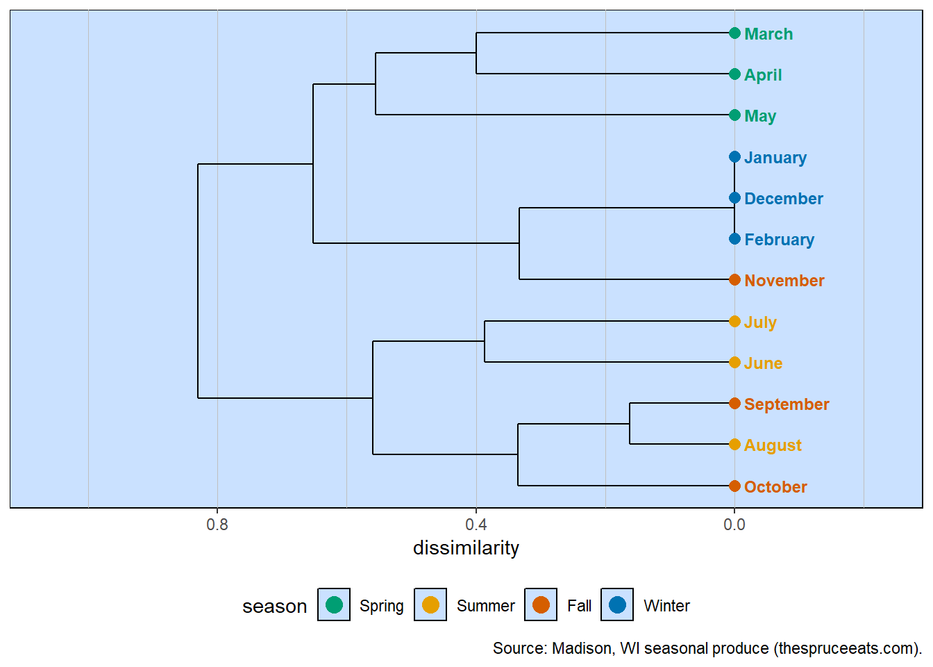
Twelve months clustered by the produce they share, coloured by calendar season.
There is real structure here, and it mostly honours the seasons — spring greens together, the warm months gathered below, the winter blues collapsed into one. But look at the winter trio: December, January and February sit at dissimilarity zero. They are identical. With the fields gone, all three sell the very same handful of stored goods. And notice November, nominally autumn, drifting over to join them. The tree clearly wants to be cut into groups — but where? Cut far to the left and you get two halves; cut to the right and you get a scatter of slivers. We need a principled height for the line.
8.3 Order is not similarity
First, one habit to unlearn, because it trips up almost everyone. The eye runs down the list of leaves and assumes that neighbours must be alike — but the order in which the months are stacked carries no meaning of its own. At every fork a dendrogram may swap its two branches without changing one thing it claims; only the heights of the joins and the question of who joins whom are fixed. Two clusters drawn at the same level can trade places freely, and the leaves inside a cluster can rotate about their join like beads on a wire.
So do not be troubled that August is printed between September and October instead of next to July. August belongs to the August–September–October group, and its position within that group is simply one of several equally correct drawings. The same is true of the winter trio shown as January, December, February: that order is arbitrary precisely because the three are identical, and no arrangement of them could be more right than another. Read the forks and the heights; never read the seating chart.
8.4 A rule for the line
The idea is to let the data’s own variability set the height. Some months are thoroughly typical of their neighbours; others are half-members that only loosely belong. So measure, for every month, how far out it sits before it joins anything at all — call it the month’s recruitment height. The most variable month, the one that holds out longest before joining, tells you how much spread a group in this data naturally contains. Draw the line exactly there, and you are saying something defensible: a group may be as loose as its loosest member that still plainly belongs.
Show the code
recruit_heights(hc) |>gt() |>cols_label(site ="month", recruit_height ="recruitment height") |>tab_header(title ="How far out each month sits before it joins") |>tab_options(table.font.size =px(12))
How far out each month sits before it joins
month
recruitment height
May
0.556
April
0.400
March
0.400
June
0.387
July
0.387
October
0.335
November
0.333
August
0.163
September
0.163
December
0.000
January
0.000
February
0.000
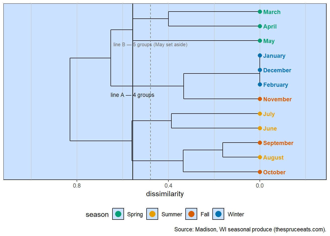
May is the most variable month, joining its spring neighbours only at 0.556; the winter trio are the most typical of all, fused at 0.00. Draw line A where May joins, and — should we judge May too odd to anchor anything — draw a stricter line B just above the next-most-variable pair, March and April, setting May aside as a one-month oddball.
Show the code
cutA <-assessment_cut(hc) # most variable month sets the cut (line A)cutB <-assessment_cut(hc, oddball =TRUE) # set that month aside (line B)line_A <- cutA$cut_heightline_B <-mean(c(cutA$cut_height, cutB$cut_height))dissimilarity(two_way, what ="site") |>dendrogram_meta_plot(info = season_tbl, by ="Site", key ="season",palette = pal_s, caption = cap) +geom_hline(yintercept = line_A, color ="grey15", linewidth =0.7) +geom_hline(yintercept = line_B, color ="grey45", linetype ="dashed") +annotate("text", x =6.0, y = line_A, label ="line A — 4 groups",hjust =0.5, vjust =-0.5, size =3, color ="grey15") +annotate("text", x =9.5, y = line_B, label ="line B — 5 groups (May set aside)",hjust =0.5, vjust =-0.5, size =2.7, color ="grey45")
The same tree with two assessment lines. Line A (May sets the cut) gives four groups; line B sets May aside for five.
Line A cuts the year into four groups: March–April–May, June–July, August–September–October, and November–December–January–February. Four seasons, just as the belief predicted — but not the calendar’s four. Spring lands exactly where the calendar puts it. Beyond that the year is redrawn: the dead of winter stretches to pull in November, true summer shrinks to June and July, and the harvest peak — August, September, October — stands apart as the real high season. The data has found a long dormant winter, a brief summer, a distinct peak, and a transitional spring.
8.5 The oddball
Line A let the single most variable month set the tolerance for every group. Sometimes that month is not a loose member but a genuine oddity that should answer for itself. May is a fair candidate: it joins spring only at 0.556, well above the tight March–April core at 0.40. Line B takes that view. Setting May aside and letting March and April set the height, the cut falls just above 0.40 and May drops out on its own — five groups now, with May a one-month season of its own (asparagus and rhubarb arriving, the storage bins not yet empty). Whether you prefer four groups or five is a judgement, but it is now a named judgement: keep the most variable month, or set it aside. State which, and the lines are fixed.
8.6 What the metadata adds
The four groups are not merely relabelled months; they are a gradient of how the produce arrives, which is exactly the fresh-or-stored mark we set aside earlier.
The peak group is 97% fresh, early summer 90%, spring a mixed 47%, and the long winter only 19% — and that last figure is the whole reason the winter months look identical. They are alike because the market has fallen back on the same stored roots and squashes. The metadata does not just decorate the groups; it explains why they exist. That is the move from the previous chapter, paid off: a grouping earns its meaning when you can hang an outside fact on it.
8.7 Constructs, not proofs
A human decision still sits at the centre of this — we drew a line. But it is no longer a private act of the eye; it is a rule stated in the open: the most variable site sets the group’s tolerance, with a named exception for a true oddball. State the rule and anyone, given the same list, redraws the same lines and reaches the same groups. That reproducibility is the entire difference between an argument and a fact wearing an argument’s clothes. The seasons we found are constructs — defensible, repeatable, and tied to real metadata — not a claim that nature keeps exactly four seasons in Wisconsin.
A closing note on design, because it is easy to assume there is only one way to draw such a line. An older tradition draws it from the other direction. When you have sites paired by design — replicates you already know belong together and do not want split apart — you set the line so those known pairs survive the cut, and the largest within-pair difference becomes the bound of “the same.” That is the paired-replicate design. Here we had no such pairs; we let the most variable site set the line instead. Different experimental designs, the same honest spirit: decide the rule before you read the tree, so that “where do the groups end?” stops being a guess and becomes a measurement.
And that closes the loop the book opened with. The list you already keep — what each stall sells, what each month brings — need not sit frozen. Read it in, look at it, lay it flat, measure it, draw the tree, and cut it by a rule you can defend. What was a column of notes becomes a set of groups that mean something, and that anyone can find again.