Statistics & Data Analysis
I’m mostly interested in computer code so I can analyze data. Here are some examples.
Basic Statistics
This example works through a very basic use of statistics, that of comparing two populations.
What is the python code used to run a simple t-test?
Here's an example Python code for running a simple independent samples t-test using the scipy.stats module:
import scipy.stats as stats
# Define two groups of data
group1 = [1, 2, 3, 4, 5]
group2 = [6, 7, 8, 9, 10]
# Run a two-sided t-test assuming equal variances
t_statistic, p_value = stats.ttest_ind(group1, group2)
# Print the results
print("T-statistic:", t_statistic)
print("P-value:", p_value)
In this example, we define two groups of data (group1 and group2) and then use the ttest_ind function to perform an independent samples t-test. The ttest_ind function returns the t-statistic and p-value for the test.
The ttest_ind function assumes that the variances of the two groups are equal. If this assumption is not met, you can set the equal_var parameter to False to perform a Welch's t-test, which does not assume equal variances.
Note that the scipy.stats module provides many other statistical functions and tests, and it is a powerful tool for statistical analysis in Python.
Can this code be converted to R?
Yes, the code for a simple t-test can be easily converted to R. Here's an example code for running a two-sample t-test in R:
# Define two groups of data
group1 <- c(1, 2, 3, 4, 5)
group2 <- c(6, 7, 8, 9, 10)
# Run a two-sided t-test assuming equal variances
t_test <- t.test(group1, group2)
# Print the results
print(t_test)
In this example, we define two groups of data (group1 and group2) and then use the t.test function to perform a two-sample t-test. The t.test function returns an object of class "htest" that contains various information about the test, such as the t-statistic, the degrees of freedom, the p-value, and a confidence interval for the difference in means.
The t.test function assumes that the variances of the two groups are equal by default. If this assumption is not met, you can set the var.equal parameter to FALSE to perform a Welch's t-test, which does not assume equal variances.
R is a powerful statistical programming language and offers a wide range of built-in functions and packages for statistical analysis. The t.test function is just one example of the many statistical functions available in R.
What would I change if I suspect the variances are different?
If you suspect that the variances of the two groups are different, you can perform a Welch's t-test instead of the standard independent samples t-test assuming equal variances. In R, you can specify the var.equal parameter to be FALSE to perform a Welch's t-test. Here's an example code:
# Define two groups of data
group1 <- c(1, 2, 3, 4, 5)
group2 <- c(6, 7, 8, 9, 10)
# Run a two-sided t-test assuming unequal variances
t_test <- t.test(group1, group2, var.equal = FALSE)
# Print the results
print(t_test)
In this example, we set the var.equal parameter to FALSE in the t.test function to perform a Welch's t-test. The t.test function will now assume that the variances of the two groups are different and will calculate the degrees of freedom using a different formula.
Note that the standard independent samples t-test assuming equal variances has higher power when the variances are actually equal. However, if you suspect that the variances are different, it is generally more appropriate to perform a Welch's t-test, as it is more robust to unequal variances.
In this example, what would I add to the code to test for unequal variances?
To test for unequal variances before running a t-test, you can use the var.test function in R. The var.test function tests the null hypothesis that the variances of the two groups are equal.
Here's an example code that tests for unequal variances before running a two-sample t-test:
# Define two groups of data
group1 <- c(1, 2, 3, 4, 5)
group2 <- c(6, 7, 8, 9, 10)
# Test for unequal variances
var_test <- var.test(group1, group2)
# Print the results of the variance test
print(var_test)
# Run a t-test assuming unequal variances
t_test <- t.test(group1, group2, var.equal = FALSE)
# Print the results of the t-test
print(t_test)
In this example, we first use the var.test function to test for unequal variances. The var.test function returns an object of class "htest" that contains various information about the test, such as the F-statistic, the degrees of freedom, and the p-value.
If the p-value from the variance test is less than the significance level (typically 0.05), it indicates that the variances of the two groups are significantly different. In this case, we set the var.equal parameter to FALSE in the t.test function to perform a Welch's t-test.
Note that testing for unequal variances before running a t-test is a good practice, as it ensures that the assumptions of the t-test are met and can help to avoid incorrect conclusions due to unequal variances.
Cluster Analysis
Finding patterns in data is an important task in many data analysis studies. It isn’t something that finds its way into statistics classes (to my knowledge). This example jumps right in with a very direct question.
What is a K-means analysis?
K-means analysis is a popular unsupervised machine learning technique used for clustering and data exploration. It is a type of clustering algorithm that groups data points into clusters based on their similarity.
The "K" in K-means refers to the number of clusters that the algorithm should create. The algorithm starts by selecting K initial centroids (points that represent the center of the clusters), and then iteratively assigns each data point to the nearest centroid and updates the centroid based on the mean value of the points in that cluster. This process continues until the centroids no longer move significantly, at which point the algorithm converges.
The output of the K-means analysis is a set of K clusters, where each data point is assigned to one of the clusters based on its similarity to the centroid. The clusters are constructed in a way that maximizes the similarity between the points within each cluster and minimizes the similarity between the points in different clusters.
K-means is a useful technique for discovering underlying patterns or structure in data, identifying outliers, and reducing the dimensionality of data by grouping similar data points together. It is widely used in fields such as data science, pattern recognition, and image processing.
Can this be shown with a simple example?
Certainly! Here's a simple example to illustrate how the K-means algorithm works:
Let's say we have a dataset consisting of 10 two-dimensional points
(x, y):
(2, 4), (3, 5), (4, 6), (10, 15), (12, 17), (11, 16), (25, 28), (24, 27), (27, 30), (30, 33)
Our goal is to group these points into two clusters using the K-means algorithm.
Step 1: Initialization
We start by randomly selecting two initial centroids. Let's choose (3, 5) and (27, 30) as our initial centroids.
Step 2: Assign points to clusters
Next, we assign each point to the cluster that is closest to its centroid. Using the Euclidean distance metric, we calculate the distance between each point and each centroid:
For centroid (3, 5):
- Point (2, 4) is 1.41 units away
- Point (3, 5) is 0 units away
- Point (4, 6) is 1.41 units away
- Point (10, 15) is 12.21 units away
- Point (12, 17) is 14.14 units away
- Point (11, 16) is 13.45 units away
- Point (25, 28) is 25.94 units away
- Point (24, 27) is 24.74 units away
- Point (27, 30) is 25 units away
- Point (30, 33) is 30.68 units away
For centroid (27, 30):
- Point (2, 4) is 36.4 units away
- Point (3, 5) is 33.54 units away
- Point (4, 6) is 30.68 units away
- Point (10, 15) is 19.21 units away
- Point (12, 17) is 15.81 units away
- Point (11, 16) is 17.1 units away
- Point (25, 28) is 2.24 units away
- Point (24, 27) is 3.61 units away
- Point (27, 30) is 0 units away
- Point (30, 33) is 4.24 units away
Based on these distances, we assign each point to the cluster with the closest centroid. In this case, the assignments are:
Cluster 1: (2, 4), (3, 5), (4, 6)
Cluster 2: (10, 15), (12, 17), (11, 16), (25, 28), (24, 27), (27, 30), (30, 33)
Step 3: Update centroids
Now that we have assigned the points to clusters, we update the centroids by calculating the mean of the points in each cluster:
Cluster 1: (2+3+4)/3 = (3, 5)
Cluster 2: (10+12+11+25+24+27+30)/7 = (20.14, 23.86)
Step 4: Repeat until convergence
We repeat steps 2 and 3 until the centroids no longer move significantly. In this case, after one more iteration, the centroids converge and the algorithm stops.
The final [note: the answer stops here, but that’s OK for this example.]
What would that look like in R code?
Sure! Here's an example of how to perform K-means analysis in R using the built-in kmeans() function with the same data as in the previous example:
# create a data frame with the data
data <- data.frame(x = c(2, 3, 4, 10, 12, 11, 25, 24, 27, 30),
y = c(4, 5, 6, 15, 17, 16, 28, 27, 30, 33))
# perform K-means analysis with 2 clusters
kmeans_result <- kmeans(data, centers = 2)
# print the cluster assignments and centroids
print(kmeans_result$cluster) # cluster assignments (1 or 2)
print(kmeans_result$centers) # centroid coordinates
# plot the data with the clusters colored differently
plot(data, col = kmeans_result$cluster)
points(kmeans_result$centers, col = 1:2, pch = 8, cex = 2)
This code creates a data frame with the x and y coordinates of the points, then performs K-means analysis with 2 clusters using the kmeans() function. The resulting cluster assignments and centroid coordinates are printed to the console, and the data points are plotted with the clusters colored differently and the centroids marked with large points.
The kmeans() function takes several arguments, including the data, the number of clusters (centers), and the initialization method (nstart, which specifies the number of random initializations to try). It returns a list with several elements, including the cluster assignments (cluster) and the coordinates of the final centroids (centers).
As a test, the code was put into R (using RStudio) and run without modification. The results follow. Perhaps not the visually compelling presentation, but this is confirmation that the code works.
[1] 1 1 1 1 1 1 2 2 2 2
x y
1 7.0 10.5
2 26.5 29.5

Network Diagrams 1
Bill is friends with Sue, Fred, Max and Mary. Sue counts Bill, Max and Jane as her friends. Fred knows Bill, Sue and Jane. Max only knows Bill. Jane knows Sue and Fred and is also friends with Sam. Mary knows Bill and Sam. Generate some R code to represent the relationships between these people.
# Install and load the igraph package
##install.packages("igraph")
library(igraph)
# Create a list of all the people
people <- c("Bill", "Sue", "Fred", "Max", "Mary", "Jane", "Sam")
# Create a matrix to represent the relationships between the people
# If person i is friends with person j, then the element at row i, column j is set to 1
# Otherwise, it is set to 0
relationships <- matrix(0, nrow = length(people), ncol = length(people))
rownames(relationships) <- people
colnames(relationships) <- people
# Set the elements of the matrix to reflect the relationships described in the question
relationships["Bill", "Sue"] <- 1
relationships["Bill", "Fred"] <- 1
relationships["Bill", "Max"] <- 1
relationships["Bill", "Mary"] <- 1
relationships["Sue", "Bill"] <- 1
relationships["Sue", "Max"] <- 1
relationships["Sue", "Jane"] <- 1
relationships["Fred", "Bill"] <- 1
relationships["Fred", "Sue"] <- 1
relationships["Fred", "Jane"] <- 1
relationships["Max", "Bill"] <- 1
relationships["Jane", "Sue"] <- 1
relationships["Jane", "Fred"] <- 1
relationships["Jane", "Sam"] <- 1
relationships["Mary", "Bill"] <- 1
relationships["Mary", "Sam"] <- 1
# Create an igraph object from the matrix
g <- graph_from_adjacency_matrix(relationships, mode = "undirected", weighted = TRUE)
# Plot the graph
plot(g)
The code above reflects the original answer and the addition of the request to visualize the results. This did what was needed, although the graphics quality needs some help.
Network Diagrams 2
This is a more complex request although the data are similar to the previous example. This test uses an Assistant (characteristics are in the “Run Instructions”) and asks for a different network diagram.
User
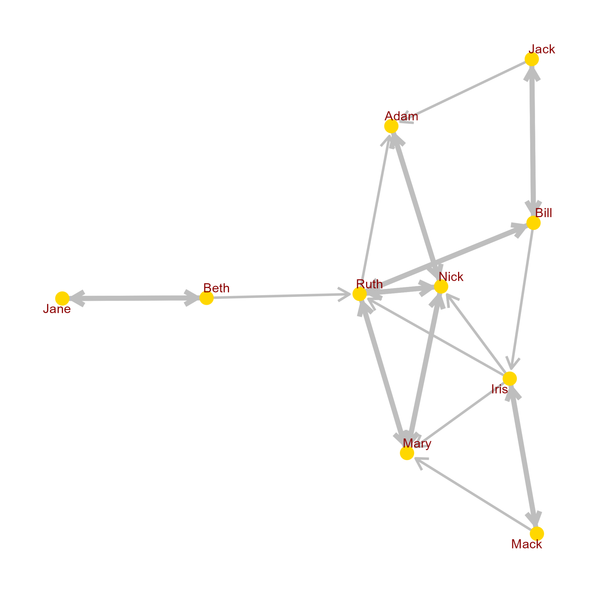
A body of text describes relationships between individuals. Note that the relationships are not always mutual. Some individuals consider other people to be friends while the opposite is not always true. I need a plot that shows a bold line between people who have declared a mutual friendship and a thin line for the one-way relationships. Here are the data: """Bill is friends with Ruth, Jack and Iris. Ruth knows Bill along with Nick, Adam, and Mary. Jack considers Bill and Adam to be his friends. Mary hangs out with Ruth and Nick. Nick's friends include Mary, Ruth and Adam. Jane and Beth are good friends. Mack, Iris, and Mary are often seen together. Beth is chummy with Jane and is sometimes out with Ruth. Iris spends time with Mack, Mary, Ruth and Nick. Adam hangs with Nick and Ruth."""
Run instructions
You know how to interpret social data to determine the linkages between individuals. You use this skill to create datasets in a form that allows for network analysis. You are also skilled at coding the R language to analyze network datasets. You can create tables with relationship data and code modules that can be run to create visual representations of the data.
Network Analyst
To create a visual representation of these relationships, we will first extract the data and organize it into a dataset, then generate the network plot. Here are the steps to achieve this in R.
Install and load requisite packages if they are not already installed:
# Install the packages if they are not installed yet
if (!requireNamespace("igraph", quietly = TRUE)) install.packages("igraph")
if (!requireNamespace("ggraph", quietly = TRUE)) install.packages("ggraph")
if (!requireNamespace("tidyverse", quietly = TRUE)) install.packages("tidyverse")
# Load the packages
library(igraph)
library(ggraph)
library(tidyverse)
Create a relationship data frame:
# Create a data frame with the relationships
relationships <- data.frame(
from = c("Bill", "Bill", "Bill", "Ruth", "Ruth", "Ruth", "Ruth","Jack", "Jack",
"Mary", "Mary", "Nick", "Nick", "Nick", "Jane", "Beth", "Mack", "Mack",
"Iris", "Iris", "Iris", "Iris", "Adam", "Beth", "Iris"),
to = c("Ruth", "Jack", "Iris", "Bill", "Nick", "Adam", "Mary", "Bill", "Adam",
"Ruth", "Nick", "Mary", "Ruth", "Adam", "Beth", "Jane", "Iris", "Mary",
"Mack", "Mary", "Ruth", "Nick", "Nick", "Ruth", "Nick"))
Process the dataset to find mutual relationships and adjust the thickness:
# Find mutual relationships and create a new column for edge width
relationships %>%
mutate(mutual = map2_chr(from, to, ~ ifelse(any(relationships$from == .y & relationships$to == .x), "yes", "no")),
edge_width = if_else(mutual == "yes", 2, 1)) -> relationships_mutual
# Create an igraph object from the processed data frame
graph <- graph_from_data_frame(relationships_mutual, directed = TRUE)
Plot the network visual representation:
# Plotting the network using ggraph
set.seed(123) # For reproducibility
ggraph(graph, layout = 'kk') +
geom_edge_link(aes(edge_width = edge_width), arrow = arrow(length = unit(4, 'mm')), end_cap = circle(3, 'mm')) +
geom_node_point(color = "darkblue", size = 5) +
geom_node_text(aes(label = name), repel = TRUE, color = "darkred", fontface = "bold") +
theme_graph()
This code will plot a network graph where mutual friendships are represented by bold lines (with edge width 2) and one-way relationships are represented by thin lines (with edge width 1).
Feel free to adjust the color, size, and font style of the points and the texts to match any preferences you have. The set.seed() function ensures that the layout of the graph is reproducible if you rerun the code. The Kamada-Kawai layout algorithm ("kk") is used to spread the nodes in a way that tries to reflect the network structure intuitively.
The code built a good framework. There were some needed modifications in the colors and sizes. That was even suggested by ChatGPT. After a few changes in the R code, including a change of the layout algorithm to “stress” and the removal of the legend, an acceptable plot was created.
The key thing to note in this example is the complexity of the statement that finds mutual relationships. I’d not have come up with that without a lot of work.
Like a lot of the examples of ChatGPT, this product was something that was available to be molded by someone familiar with the domain. In this case, the “heavy lifting” was done by ChatGPT and the tune-up required just a few iterations with small code modifications.
Further, the code is now quite generalized and new data can be supplied for other projects.
Network Topology
This example focuses on having really minimal data about the topology of a set of poles. Each pole knows only the identity of its two nearest neighbors. Once the topology is established, then there are some interesting questions, such as how many links there are between two poles.
For someone who doesn’t know anything about graph theory, this is a challenging problem.
The following set of questions to ChatGPT produced R code. These code snippets were added together and run inside R Studio. The dialog is shown here without the code responses. The final R code is shown at the end, along with some of the results.
User
I have ten poles, each identified by a letter. I know the identity of the two nearest poles to each pole. Is there a way using the R language to calculate the topology of the poles?
ChatGPT
Yes, in R, you can calculate the topology of your ten poles based on their nearest neighbors using graph theory concepts. The igraph package in R is particularly useful for this kind of analysis. Here's a general approach to achieve this:
Install and Load the igraph Package: If you haven't already installed it, you can do so using ‘install.packages("igraph")’. Then, load the package with ‘library(igraph)’.
Create a Data Structure for Your Poles: You need to represent your poles and their nearest neighbors. This can be done using a matrix or a dataframe. For instance, if you have poles A to J, and you know their nearest neighbors, you might represent this in a two-column dataframe where each row represents a pole and its nearest neighbor.
Construct a Graph Object: Using the ‘graph_from_data_frame’ function, you can turn your dataframe into a graph object. This function treats each row as an edge in the graph.
Analyze the Graph: Once you have your graph, you can perform various analyses to understand its topology. Functions like ‘plot’, ‘degree’, ‘neighbors’, ‘shortest_paths’, etc., can be very helpful.
Here's a simple example to illustrate:
[R code removed; see final code block]
Remember, the specific functions and analyses will depend on what exactly you're looking to understand about the topology of your poles. The ‘igraph’ documentation is quite extensive and should provide more detailed guidance on specific functions and their usage.
User
Can you create a test set of data for this problem that I can insert into the program?
ChatGPT
Certainly! Let's create a test dataset for your problem involving ten poles, each identified by a letter (A to J), along with the identity of their two nearest poles.
I'll provide you with a sample dataset in a format suitable for R. In this example, each pole (A to J) will be listed alongside its two nearest neighbors. This setup assumes an undirected relationship, meaning if A is near B, B is also near A.
Here's your test dataset:
[R code removed; see final code block]
This dataset implies, for example, that pole A's nearest neighbors are B and C, pole B's nearest neighbors are A and D, and so on. When you input this into the R program using the ‘igraph’ package, you can analyze the topology of this network of poles. Remember, the relationships are bidirectional in this case, as is common in undirected graphs.
User
Is there an igraph function that will let me calculate the number of links between two poles?
ChatGPT
Yes, in ‘igraph,’ the function you're looking for to calculate the number of links (or the path length) between two poles is ‘shortest_paths()’. This function computes the shortest path between specified vertices in a graph. It's a powerful tool for analyzing the connections in a network.
Here's how you can use ‘shortest_paths()’:
[R code removed; see final code block]
Define the Source and Target Poles: You need to specify the vertices (poles in your case) between which you want to calculate the path length. In ‘igraph,’ vertices can be referred to by their names if you have named them.
Use shortest_paths(): This function will calculate the shortest path between the specified vertices. The output includes the path itself and the length of the path.
Extract the Path Length: The result from ‘shortest_paths()’ includes various details about the path. To get just the number of links (or edges) in the shortest path, you can extract the length of the path.
Here's an example using the data structure from your previous query:
[R code removed; see final code block]
In this example, ‘path_result$vpath’ gives you the actual path, and by taking the length of this path and subtracting 1, you get the number of links between the two poles. The subtraction is necessary because the length includes both the starting and ending vertices.
Remember to adjust the ‘from’ and ‘to’ parameters to calculate the path between different poles as per your requirement.
Final Code Block
{r}
# Install and load igraph package
install.packages("igraph")
library(igraph)
# Example data (replace this with your pole data)
# Assuming each row is Pole, Nearest Neighbor
# Test data for poles and their nearest neighbors
data <- data.frame(
Pole = c("A", "A", "B", "B", "C", "C", "D", "D", "E", "E",
"F", "F", "G", "G", "H", "H", "I", "I", "J", "J"),
Neighbor = c("B", "C", "A", "D", "A", "D", "B", "E", "D", "F",
"E", "G", "F", "H", "G", "I", "H", "J", "I", "A")
)
# Print out the data
print(data)
# Create graph
g <- graph_from_data_frame(data, directed = FALSE)
# Plot the graph to visualize the topology
plot(g)
# You can also calculate various properties
degrees <- degree(g)
# ... and other analyses as needed
print(degrees)
# Assuming 'g' is your graph object from the previous example
# Calculate the shortest path between two poles, say A and E
path_result = shortest_paths(g, from = "A", to = "E")
# The length of the path (number of links)
path_length = lengths(path_result$vpath)[1] - 1
# Print the path length
print(path_length)
###############################################################
## Add this to the Console to get the plot
png(file = "topology.png",width=2000, height = 2000, res = 300)
plot(g)
dev.off()
The User added the code below the hash line (##### etc). Note that this code is not intended to run in R Studio (for some strange limitation). Instead, copy this to the Console and you’ll get a file with the image of the network. This is shown below.
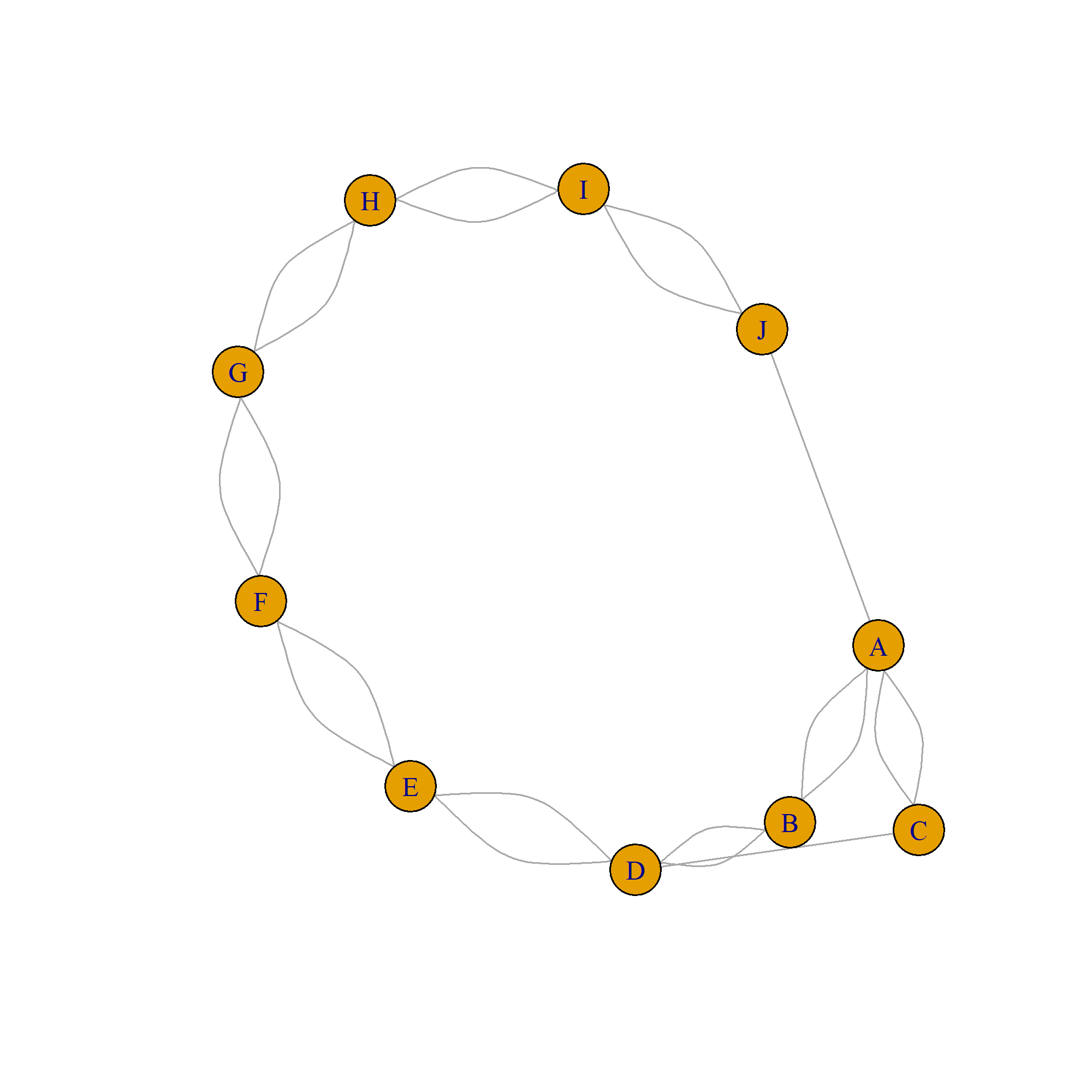
The result of the degrees function (number of edges for each node) is:
A B C D E F G H I J
5 4 3 5 4 4 4 4 4 3
The shortest path from A to E is: 3
Two-Way Tables
A two-way table is an essential tool for phytosociologists and other scientists to analyze and summarize data on the presence or absence of different categories or groups. It can be particularly useful when studying the distribution of plant species in different plots of land or other ecological settings.
To create a two-way table, a researcher can record the presence or absence of different tree species in multiple sites and organize the data in a table format. The rows of the table represent the different tree species, while the columns represent the different sites. A value of "1" is placed in the table for each species that occurs on a site, and a value of "0" is placed for each species that is absent.
Due to the high number of 0 values often present in a two-way table, traditional numerical computations may not be effective for analyzing the data. Instead, researchers can calculate the similarities between the columns (site comparisons) or the rows (species comparisons) to analyze the relationship between the different categories.
The problem is that many people are unaware of the ways to analyze the two-way table data. That sets us up for a conversation with ChatGPT.
What is a two-way table as it is used by phytosociologists?
In phytosociology, a two-way table, also known as a crosstabulation table, is a table that displays the frequencies or counts of two categorical variables in a cross-tabulated format. It is used to analyze and summarize the relationship between the two variables.
For example, suppose a phytosociologist is studying the distribution of plant species in a particular ecosystem. They might collect data on the presence or absence of certain plant species in different plots of land within the ecosystem. The phytosociologist could then create a two-way table to summarize the data, with one variable representing the presence or absence of each plant species and the other variable representing the different plots of land.
The two-way table allows the phytosociologist to see how the presence or absence of each plant species varies across the different plots of land. It can also be used to calculate statistical measures such as relative frequency, percentage, and chi-square to analyze the relationship between the two variables.
How can a cross-tabulation table be used to create a dendrogram?
A dendrogram is a graphical representation of a tree-like structure that shows the hierarchical relationship between different categories or groups. In phytosociology, dendrograms are often used to visualize the relationship between different plant species or plant communities based on their presence or absence in different plots of land.
One way to create a dendrogram from a cross-tabulation table is to use a clustering algorithm. Clustering algorithms are mathematical techniques that can be used to group similar objects together based on their characteristics or features.
To create a dendrogram using a cross-tabulation table, the phytosociologist would first need to calculate a measure of similarity or dissimilarity between the different plant species or plant communities. This can be done using a variety of techniques, such as Jaccard similarity, Bray-Curtis dissimilarity, or Euclidean distance.
Next, the phytosociologist would use a clustering algorithm, such as hierarchical clustering, to group the plant species or plant communities into clusters based on their similarity or dissimilarity. The dendrogram is then created by plotting the clusters on a tree-like diagram, with the most similar clusters closer together and the least similar clusters further apart.
The dendrogram can be used to visualize the relationship between the different plant species or plant communities and to identify patterns or trends in the data. It can also be used to guide further analysis, such as determining the optimal number of clusters or identifying relationships between different ecological factors.
Can you show me the R code to perform such an analysis?
Certainly! Here is an example of how you can use the vegan package in R to create a dendrogram from a cross-tabulation table of plant species presence or absence in different plots of land:
# First, install and load the vegan package
install.packages("vegan")
library(vegan)
# Next, load your data into R. Here, we'll use a built-in dataset from the vegan package called "varespec"
data("varespec")
# The varespec dataset is already in the correct format for creating a dendrogram, but you can use the following code to
# reshape your own data into the correct format if necessary:
# data <- as.matrix(your_data_frame)
# Calculate the Bray-Curtis dissimilarity between the different plots of land using the vegdist function
dissimilarity <- vegdist(data, method = "bray")
# Use the hclust function to perform hierarchical clustering on the dissimilarity matrix
cluster <- hclust(dissimilarity, method = "ward.D2")
# Plot the dendrogram using the plot function
plot(cluster)
# You can also use the cutree function to cut the dendrogram at a certain height and create clusters
# Here, we'll cut the dendrogram at a height of 50
clusters <- cutree(cluster, h = 50)
This code will calculate the Bray-Curtis dissimilarity between the different plots of land based on the presence or absence of different plant species, perform hierarchical clustering on the dissimilarity matrix, and plot the resulting dendrogram. You can adjust the method argument in the vegdist and hclust functions to use a different similarity or dissimilarity measure or clustering method if desired.
I hope this helps! Let me know if you have any questions.
I got an error: Error in hclust(dissimilarity) :
NA/NaN/Inf in foreign function call (arg 10)
It looks like you are encountering an error when trying to perform hierarchical clustering using the hclust function. This error can occur if the input data contains missing values (NA) or infinite values (Inf).
To troubleshoot this error, you can try the following steps:
Check your data for missing or infinite values using the is.na and is.infinite functions. For example:
# Check for missing values
any(is.na(data))
# Check for infinite values
any(is.infinite(data))
If you find any missing or infinite values in your data, you will need to handle them before you can perform hierarchical clustering. One option is to remove any rows or columns that contain missing or infinite values using the complete.cases function:
# Remove rows or columns with missing or infinite values
data <- data[complete.cases(data), complete.cases(data)]
If you prefer to impute missing values rather than removing them, you can use one of the many imputation methods available in R. For example, you can use the imputeTS package to impute missing values using linear interpolation or the mice package to impute missing values using multiple imputation by chained equations.
After handling any missing or infinite values in your data, try running the hclust function again. If the error persists, there may be other issues with your data that are causing the error. You can try running the summary function on your data to get more information about the data, or you can try using a different similarity or dissimilarity measure in the vegdist function to see if that resolves the error.
I hope this helps! Let me know if you have any other questions.
Can the 'hclust' function work with missing values?
The hclust function in R is designed to work with complete data and does not have built-in capabilities to handle missing values. This means that if your data contains missing values (NA), the hclust function will return an error when you try to perform hierarchical clustering.
To use the hclust function with data that contains missing values, you will need to handle the missing values in some way before running the function. One option is to remove any rows or columns that contain missing values using the complete.cases function:
# Remove rows or columns with missing values
data <- data[complete.cases(data), complete.cases(data)]
Alternatively, you can impute the missing values using one of the many imputation methods available in R. For example, you can use the imputeTS package to impute missing values using linear interpolation or the mice package to impute missing values using multiple imputation by chained equations.
Once you have handled the missing values in your data, you can then run the hclust function as usual to perform hierarchical clustering.
I hope this helps! Let me know if you have any other questions.
Can you show me some example data for the cross-tabulation table?
Certainly! Here is an example of a cross-tabulation table that displays the presence or absence of three plant species (A, B, and C) in four different plots of land (1, 2, 3, and 4):
Plot 1 Plot 2 Plot 3 Plot 4
A 1 0 1 1
B 0 1 0 1
C 1 1 0 1
In this example, the value "1" indicates that the plant species is present in the plot of land, and the value "0" indicates that the plant species is absent.
You can create a cross-tabulation table like this in R using the table function:
# Create a data frame with the presence or absence of each plant species in each plot
data <- data.frame(
A = c(1, 0, 1, 1),
B = c(0, 1, 0, 1),
C = c(1, 1, 0, 1),
Plot = c(1, 2, 3, 4)
)
# Create the cross-tabulation table using the table function
table(data$Plot, data$A)
This code will create a cross-tabulation table with the presence or absence of plant species A in each plot of land. You can use the table function to create a cross-tabulation table for any combination of variables in your data.
I hope this helps! Let me know if you have any other questions.
The result was a successful run with R. A dendrogram was produced.
Bar Chart
A bar chart is a basic data visualization tool. Customizing the appearance, such as adding a different color to a bar to highlight its importance, is a useful practice.
Creating a simple graphic like a bar chart in R can be problematic. This example shows how the bars get rearranged so the emphasis is on the wrong bar. The dialog with ChatGPT shows how this can be fixed.
User
I need a bar chart created using the R language. All of the bars are to be filled in with yellow except for the third bar; it should be filled in with light green. The data are supplied with the name of the bar and its value as pairs. The y label is "Revenue ($)". Here are the data: """Housing, 238; Food, 154; Transportation, 453; Internet, 121; Entertainment, 228"""
ChatGPT
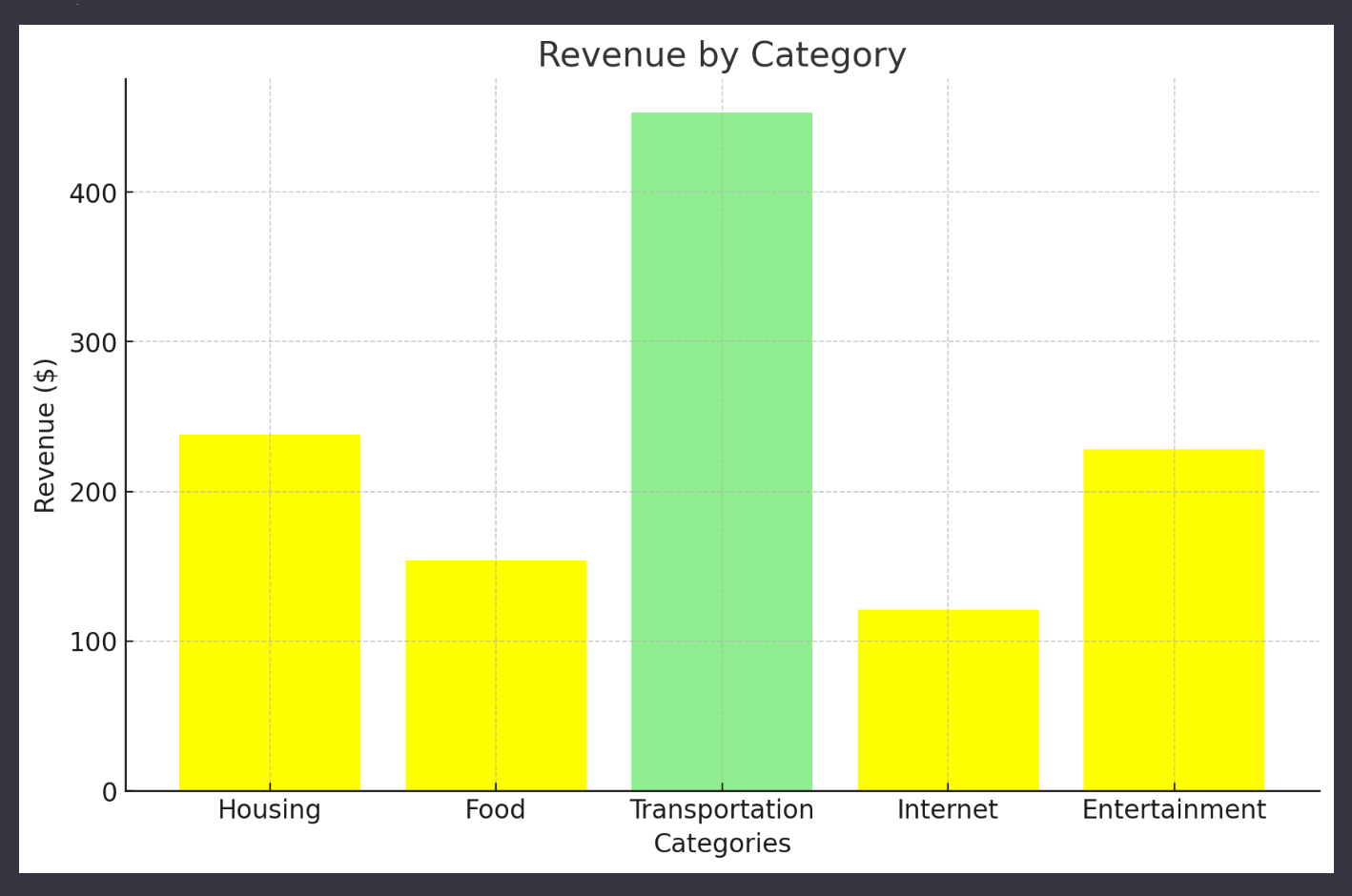
Here's the bar chart created using Python's Matplotlib, as I don't have the capability to directly execute R code. However, you can easily recreate this in R using the ‘ggplot2’ package or base R plotting functions.
In this chart, the bars represent different categories with their respective revenues. All bars are filled with yellow, except for the "Transportation" category, which is highlighted in light green to distinguish it.
To replicate this in R, you can use the following approach:
Create a data frame with your categories and values.
Use ‘ggplot’ to create a bar plot.
Use ‘scale_fill_manual’ to specify the colors for each bar, setting all but the third bar to yellow and the third bar to light green.
If you need assistance with the specific R code to create this chart, please let me know, and I'll be happy to guide you through it!
User
Will you please give me the R code.
ChatGPT
Certainly! Here's an example of how you can create the bar chart in R using the ‘ggplot2’ package. This code will generate a bar chart with all bars filled in yellow except for the third bar, which will be in light green. The y-axis label is set to ‘"Revenue ($)"’.
First, make sure you have the ‘ggplot2’ package installed. If not, you can install it using ‘install.packages("ggplot2")’.
Then, use the following R script:
# Load ggplot2 package
library(ggplot2)
# Data
categories <- c("Housing", "Food", "Transportation", "Internet", "Entertainment")
values <- c(238, 154, 453, 121, 228)
# Create a data frame
data <- data.frame(Category = categories, Revenue = values)
# Define colors
colors <- c("yellow", "yellow", "lightgreen", "yellow", "yellow")
# Create the bar chart
ggplot(data, aes(x = Category, y = Revenue, fill = Category)) +
geom_bar(stat = "identity", color = "black", show.legend = FALSE) +
scale_fill_manual(values = colors) +
labs(y = "Revenue ($)", x = "") +
theme_minimal()
This script uses ‘ggplot2’ to create a bar chart where each bar's fill color is specified in the ‘colors’ vector. The ‘geom_bar’ function with ‘stat = "identity"’ is used to create the bars based on the given values. The ‘scale_fill_manual’ function is used to manually assign colors to each bar. The chart is also styled with ‘theme_minimal()’ for a clean look.
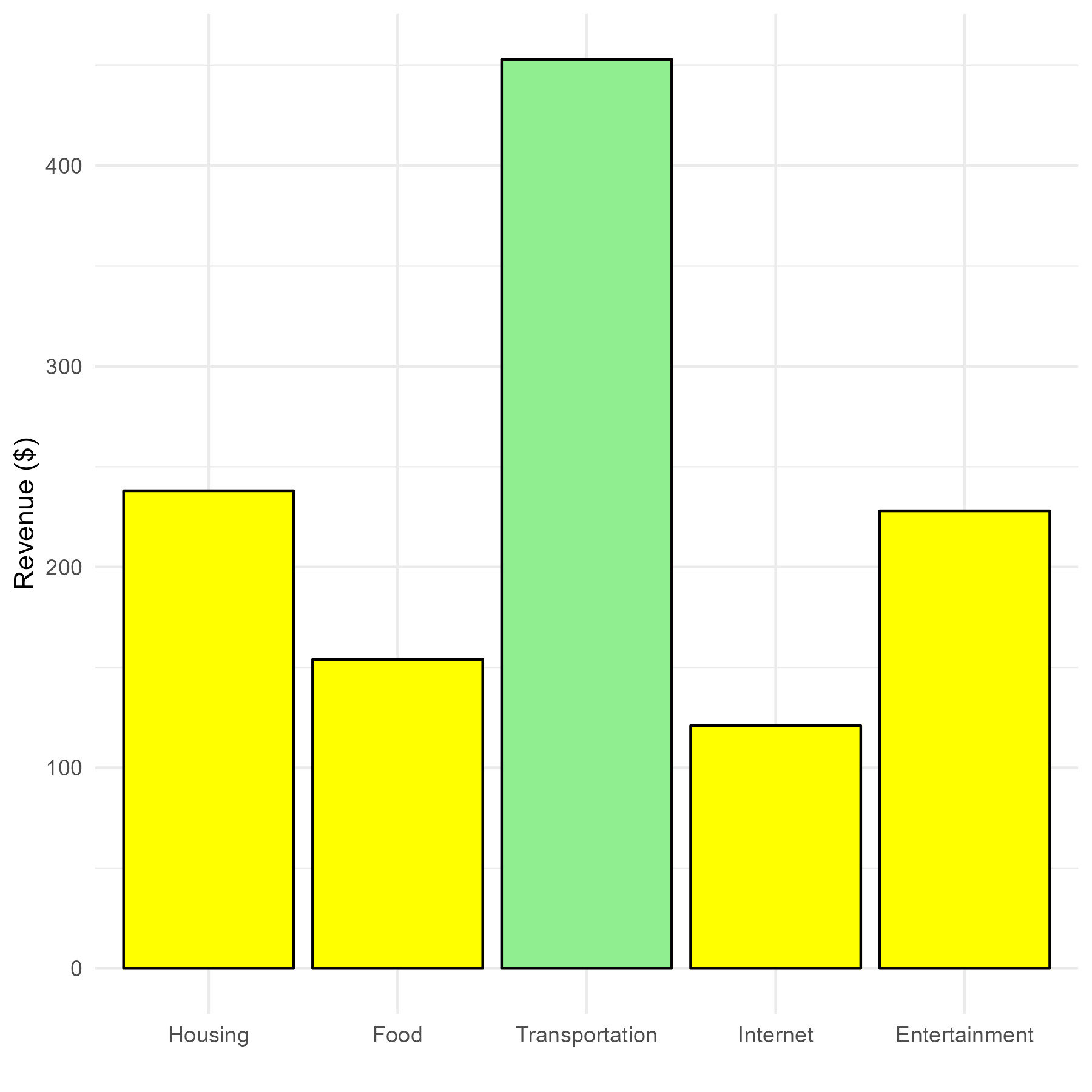
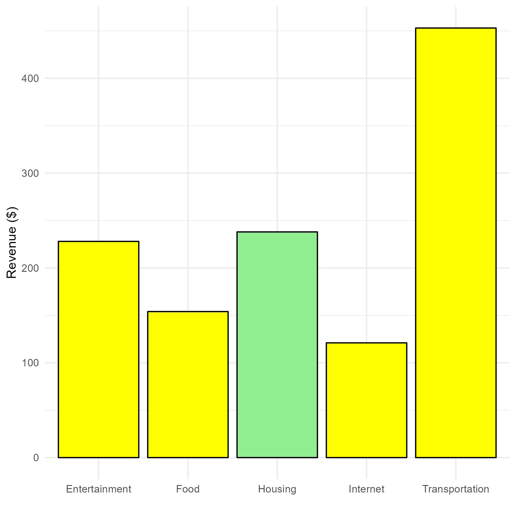
Here is the result of running the R code. Note that the order of the bars is now alphabetical (and, therefore, different from the input order). The result is the wrong bar being emphasized with the light green color.
User
Using the R code, the bars have the correct values, but the order of the bars was changed so the wrong bar is shown in light green. How can the order of the bars be made to be the same as the data input?
ChatGPT
In R, when using ‘ggplot2’ for plotting, it often automatically sorts categorical variables alphabetically. To maintain the order of the bars as per your original data input, you need to specify that the ‘Category’ variable should be treated as a factor with levels in the same order as they appear in your data. Here's how you can modify the R code to ensure the bars follow the specified order:
[Only the single line of code that is different is shown here.]
data <- data.frame(Category = factor(categories, levels = categories), Revenue = values)
In this modified script, ‘factor(categories, levels = categories)’ is used to convert the ‘Category’ variable into a factor, specifying the order of levels as they appear in your ‘categories’ vector. This way, ‘ggplot2’ will plot the bars in the order they are defined in the ‘categories’ vector, ensuring the correct bar is colored light green.
Here is the result. It is now correct.