Chapter 1 said a place offers cues for the timing of life, and that the cues differ in how dependable they are. Chapter 2 turned two of them into numbers: temperature seasonality, the size of the year’s warm-to-cold swing, and rainfall seasonality, how unevenly the rain is spread across the months. This chapter adds the third cue, daylength, and then steps back to look at all three together.
The useful idea is that a place broadcasts its year through one or more channels. Where the temperature swing is large you feel the year through warmth and cold. Where the rain is sharply seasonal you feel it through wet and dry. And almost everywhere, in a way we haven’t measured yet, the lengthening and shortening of the day keeps its own perfect time. A place’s seasonality is which of these channels are open, and how loud each one is.
Show the code
## --- Standard packages ---## many useful functions (dplyr, ggplot2, readr, tibble, purrr, tidyr)library(tidyverse)## formatted tableslibrary(gt)## --- Packages from github/kimbridges ---## install once with: remotes::install_github("kimbridges/seasonalityr")library(seasonalityr)## --- Options and defaults ---## suppress read_csv() column-type messagesoptions(readr.show_col_types =FALSE)## data source, cited under every tablesource <-"Monthly normals from WorldClim 2.1 (10 arc-minute), via seasonalityr."
3.1 The daylength channel
The first two channels had to be measured from weather records. The third one is free. The length of the day at any latitude is fixed by astronomy, so we can compute it from the latitude alone, with no climate data at all. It is the most dependable cue there is: identical for every organism at a given latitude, and exactly the same this year as last.
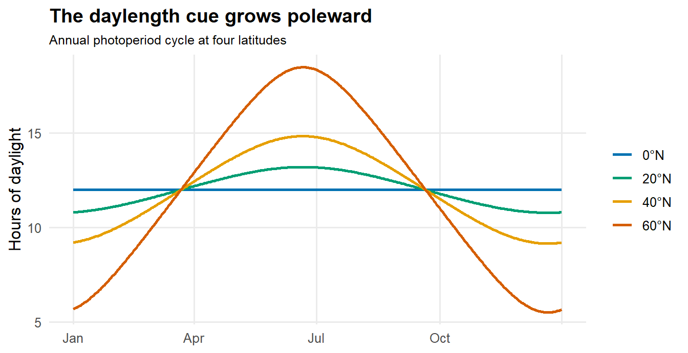
seasonalityr computes it with daylength_hours(), which returns the hours of daylight for a latitude and a day of the year. Trace it across the whole year at a few latitudes and the shape of the cue appears.
Show the code
## hours of daylight across the year at four latitudeslatitudes <-c(0, 20, 40, 60)days <-1:365cycles <-expand_grid(lat = latitudes, doy = days) |>mutate(daylight =daylength_hours(lat, doy),latitude =factor(paste0(lat, "°N"), levels =paste0(latitudes, "°N")))ggplot(cycles, aes(doy, daylight, colour = latitude)) +geom_line(linewidth =0.9) +scale_colour_manual(values =c("0°N"="#0072B2", "20°N"="#009E73","40°N"="#E69F00", "60°N"="#D55E00"), name =NULL) +scale_x_continuous(breaks =c(1, 91, 182, 274, 365),labels =c("Jan", "Apr", "Jul", "Oct", "")) +labs(x =NULL, y ="Hours of daylight",title ="The daylength cue grows poleward",subtitle ="Annual photoperiod cycle at four latitudes") +theme_minimal(base_size =12) +theme(panel.grid.minor =element_blank(),plot.title =element_text(face ="bold"), plot.subtitle =element_text(size =9.5))
At the equator the day barely changes: a flat line near twelve hours, a clock that ticks but never moves. Step poleward and the swing opens up, until at sixty degrees the longest day is more than three times the shortest. The cue is weak in the tropics and loud toward the poles, the opposite of nothing, but not much use to an equatorial organism trying to read the season from the sun.
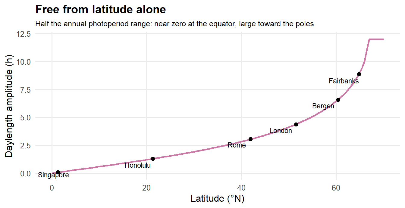
We summarize each latitude with one number, the way we did for temperature and rain. daylength_channel() returns daylamp, half the annual range of daylight hours, the amplitude of the photoperiod swing. Plotted against latitude, it is the strength of the daylength channel everywhere on Earth, read straight off a globe.
Show the code
## daylength amplitude (daylamp) as a pure function of latitudelat_grid <-tibble(lat =seq(0, 70, by =0.5))lat_grid$daylamp <-sapply(lat_grid$lat, function(L) daylength_channel(L)$daylamp)## a few familiar places as anchorsanchors <-tribble(~name, ~lat,"Singapore", 1.3,"Honolulu", 21.3,"Rome", 41.9,"London", 51.5,"Bergen", 60.4,"Fairbanks", 64.8)anchors$daylamp <-sapply(anchors$lat, function(L) daylength_channel(L)$daylamp)ggplot(lat_grid, aes(lat, daylamp)) +geom_line(colour ="#CC79A7", linewidth =1) +geom_point(data = anchors, size =2) + ggrepel::geom_text_repel(data = anchors, aes(label = name), size =3) +labs(x ="Latitude (°N)", y ="Daylength amplitude (h)",title ="Free from latitude alone",subtitle ="Half the annual photoperiod range: near zero at the equator, large toward the poles") +theme_minimal(base_size =12) +theme(panel.grid.minor =element_blank(),plot.title =element_text(face ="bold"), plot.subtitle =element_text(size =9.5))
The reason this earns a place of its own, rather than riding along with temperature, is that the two come apart. add_daylength() appends the daylength channel to a table of climate indices, using each site’s latitude. Set it beside the temperature channel for a few cities and the divergence shows.
Show the code
## the 21-city index table from Chapter 2 (bundled; built with indices_table)idx <-read_csv("data/cities_indices.csv")## add_daylength() needs a `lat` column; it appends daylamp and the peak monthidx <-add_daylength(idx)## temperature channel vs daylength channel, for four telling placesidx |>filter(name %in%c("Singapore", "London", "Moscow", "Fairbanks")) |>arrange(lat) |>select(name, lat, Tamp, daylamp) |>gt() |>fmt_number(columns =c(Tamp, daylamp), decimals =1) |>tab_header(title ="Two channels that need not agree") |>tab_footnote(footnote ="Temperature seasonality: half the annual temperature range, °C.",locations =cells_column_labels(columns = Tamp)) |>tab_footnote(footnote ="Daylength amplitude: half the annual photoperiod range, hours.",locations =cells_column_labels(columns = daylamp)) |>tab_source_note(source_note = source)
Two channels that need not agree
name
lat
Tamp1
daylamp2
Singapore
1.35
0.7
0.1
London
51.51
6.6
4.4
Moscow
55.76
13.1
5.2
Fairbanks
64.84
18.6
8.9
1 Temperature seasonality: half the annual temperature range, °C.
2 Daylength amplitude: half the annual photoperiod range, hours.
Monthly normals from WorldClim 2.1 (10 arc-minute), via seasonalityr.
London and Moscow sit at nearly the same latitude, so their daylength channels are close. But Moscow’s temperature swings hard with the continental seasons while London’s is gentle, held down by the Atlantic. London is the case that makes the point: a mild temperature channel and a strong daylength channel, in the same place. An organism there could be fooled by a warm winter, but never by the calendar of the sun. That independence is why daylength is a channel in its own right.
3.2 Reading a place by its channels
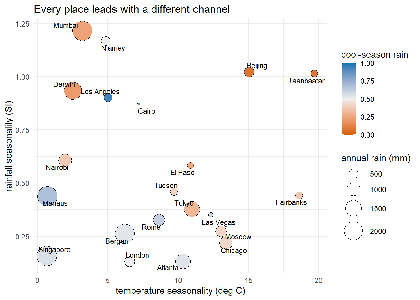
With all three channels in hand, we can place the cities in a single picture. The figure below is the package’s plot_channel() view: temperature seasonality runs along the bottom, rainfall seasonality up the side, each city is a point, its color is the rain’s timing (blue for winter rain, orange for summer), and its size is the annual rainfall.
Show the code
plot_channel(idx) +labs(title ="Every place leads with a different channel")
The plot sorts the world by how it keeps time. Down in the bottom-left corner, near the origin, sit Singapore and Manaus: almost no temperature swing and almost no rainfall swing. Those are the places where every channel is quiet, and we’ll come back to them. Up the left edge, where the temperature channel is weak but the rainfall channel is strong, are the tropical wet-dry cities, Mumbai, Darwin, Niamey, places that feel the year entirely through the rains. Off to the right, where the temperature channel is loud, are the continental cities, Moscow, Chicago, Ulaanbaatar, Fairbanks, that feel it through warmth and cold. The year is carried by whichever channel is open. Where one goes quiet, another takes over.
Two cities make the substitution vivid. Los Angeles and Tokyo sit at almost the same latitude and nearly the same temperature seasonality, but Los Angeles is blue and Tokyo is orange. Same warmth, opposite rains: Los Angeles is dry in summer and wet in winter, Tokyo the reverse. A single index, the rain’s timing, captures the textbook contrast between the west and east coasts of a continent at the same latitude.
3.3 Channel substitution across space
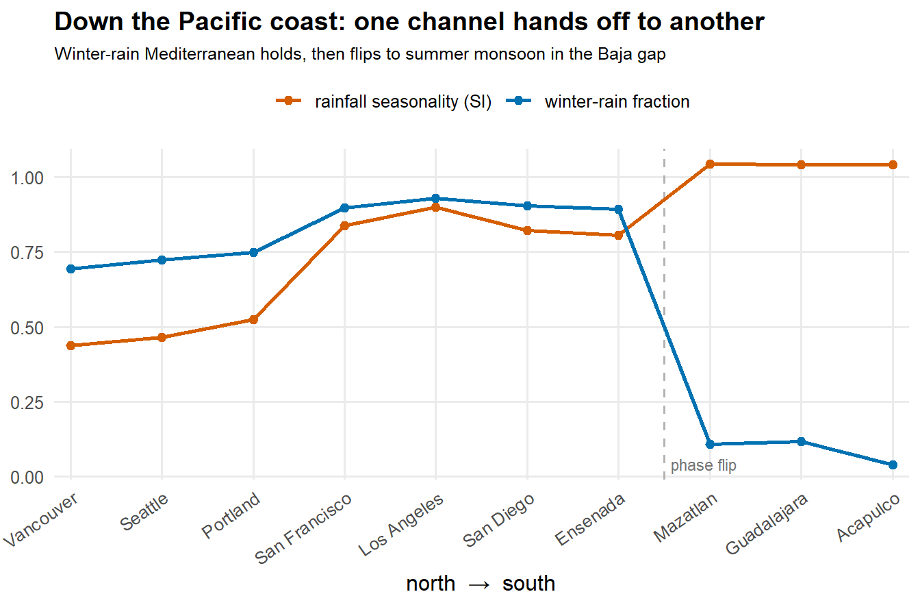
The handoff between channels is not just a fact about scattered cities. It happens along the ground, and you can walk into it. Follow the Pacific coast from Vancouver south to Acapulco and watch two numbers: the fraction of rain that falls in the cool season, which is high where rain is a winter, Mediterranean affair, and the rainfall seasonality, which rises as the year grows more sharply wet-and-dry.
Show the code
## ten coastal cities, north to south (retrieved once; see the appendix)wc <-read_csv("data/westcoast_transect.csv") |>arrange(desc(lat))wc$pos <-seq_len(nrow(wc))wc_long <- wc |>select(pos, name,`winter-rain fraction`= cool_frac,`rainfall seasonality (SI)`= SI) |>pivot_longer(c(-pos, -name), names_to ="channel", values_to ="value")ggplot(wc_long, aes(pos, value, colour = channel, group = channel)) +## the Mediterranean-to-monsoon break, in the Baja gapgeom_vline(xintercept =7.5, linetype ="dashed", colour ="grey70") +annotate("text", x =7.5, y =0.04, label ="phase flip", hjust =-0.1,size =3, colour ="grey45") +geom_line(linewidth =0.9) +geom_point(size =2) +scale_colour_manual(values =c("winter-rain fraction"="#0072B2","rainfall seasonality (SI)"="#D55E00"), name =NULL) +scale_x_continuous(breaks = wc$pos, labels = wc$name, expand =c(0.02, 0)) +labs(x ="north → south", y =NULL,title ="Down the Pacific coast: one channel hands off to another",subtitle ="Winter-rain Mediterranean holds, then flips to summer monsoon in the Baja gap") +theme_minimal(base_size =12) +theme(panel.grid.minor =element_blank(),plot.title =element_text(face ="bold"), plot.subtitle =element_text(size =9.5),axis.text.x =element_text(angle =35, hjust =1), legend.position ="top")
From Vancouver to Ensenada the rain is a winter business, and the winter-rain fraction holds high the whole way. The seasonality climbs steadily as the wet season sharpens toward southern California. Then, somewhere in the long gap of the Baja peninsula, the year turns over. By Mazatlán the winter-rain fraction has collapsed and the rain has moved to a hard summer monsoon. The change is not a smooth gradient, it is a break, a place where the coast stops being one kind of year and starts being another. Seasonality, read along the ground, is a set of stable regimes separated by sharp edges. We’ll see those same edges again when we draw the maps.
3.4 The quiet corner
Return to Singapore and Manaus, down at the origin of the channel plot. They are not unusual for being extreme. They are unusual for being flat. The temperature barely moves across the year, the rain falls in every month, and the daylength, this close to the equator, hardly changes at all. All three channels are quiet at once. This is the cue-poor zone, and it is the keystone of the whole framework.
A place with no strong cue gives life no strong clock to set itself by. That is exactly what tropical ecologists find in the everwet equatorial forests: flowering and fruiting that are weak, staggered, and continuous rather than marshaled into a shared season. The absence in the data and the absence in the biology are the same absence. It is the clearest evidence that what we are mapping is not weather, but the cue structure life actually reads.
Three channels, then, and a rule: where one falls quiet, another usually carries the year, and only in the equatorial core do all three fall quiet together. But the channels as we have them so far can still be fooled. A place can look sharply seasonal in its rain and yet be a desert where that rain hardly matters, and a place can look arid by total and yet keep a dependable wet season. Sorting the real signal from the mirage is the next channel’s worth of work, and it is where the moisture balance finally earns its keep.