Chapter 1 made a claim in words: a place’s seasonality is the set of cues it offers for the timing of life. This chapter starts to make it in numbers. We need a way to take the twelve months of a place’s climate and turn them into something we can measure, compare, and eventually map. The starting point is a picture ecologists have drawn for a century, the climate diagram, and the first move is to read a single number off it.
The running example is the desert trio from the Preface: the Mojave, the Sonoran, and the Chihuahuan. They make the chapter’s central point on their own. On paper they look almost the same. In the field they’re plainly different deserts. The difference isn’t how much of each kind of month they have. It’s when the rain comes. That’s a fact about phase, and phase is exactly what a simple tally throws away.
Show the code
## --- Standard packages ---## many useful functions (dplyr, ggplot2, readr, tibble, purrr, tidyr)library(tidyverse)## formatted tableslibrary(gt)## --- Packages from github/kimbridges ---## install once with: remotes::install_github("kimbridges/seasonalityr")library(seasonalityr)## --- Options and defaults ---## suppress read_csv() column-type messagesoptions(readr.show_col_types =FALSE)## data source, cited under every tablesource <-"Monthly normals from WorldClim 2.1 (10 arc-minute), via seasonalityr."
2.1 The Walter-Lieth climate diagram
Picture the year as twelve months, each carrying two numbers: how warm the month is, and how much rain it gets. The climate diagram of Heinrich Walter and Helmut Lieth draws both at once, and it does one clever thing. It plots precipitation against twice the temperature, on the convention that one degree Celsius lines up with two millimeters of rain. Wherever the rain curve rises above the temperature curve, the month is wet. Wherever it falls below, the month is in water deficit. The diagram turns a table of numbers into a shape you can read at a glance.
A personal note before the diagrams. Years ago I sat with Helmut Lieth in the airport in Salt Lake City, the two of us waiting out a delay with nothing to do but talk. He was a very senior ecologist and I was just starting out. Near the end, he offered the line I’ve never forgotten: every ecologist eventually becomes a phenologist. He was right. Here we are.
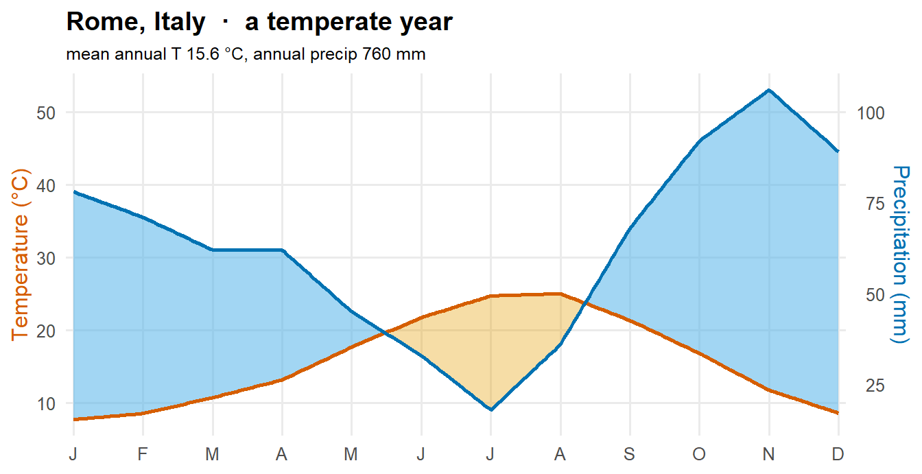
To feel what a desert diagram is saying, it helps to first see an ordinary one. Here is Rome, a temperate city most readers can picture. The orange curve is temperature; the blue curve is rainfall, plotted on the two-to-one scale. The orange shading is drought, where warmth outruns rain; the blue shading is surplus, where rain pulls ahead.
Show the code
## the temperate reference site and the desert trio, retrieved once (see the appendix)rome <-read_csv("data/temperate_reference_monthly.csv")trio_m <-read_csv("data/desert_trio_monthly.csv")## a small helper that builds a modern Walter-Lieth diagram from one site's## twelve months. Walter-Lieth uses a 2:1 precip-to-temperature scale## (1 deg C = 2 mm), so precipitation is plotted at height P/2 and a second axis## reads it back as millimeters. The year is interpolated to a fine grid so the## wet and dry fills switch cleanly where the two curves cross.walter_lieth <-function(d, title, subtitle) { grid <-tibble(x =seq(1, 12, length.out =241)) grid$T <-approx(d$month, d$tavg, grid$x)$y grid$Ps <-approx(d$month, d$prec /2, grid$x)$yggplot(grid, aes(x)) +## drought: temperature curve above the precip curvegeom_ribbon(aes(ymin = Ps, ymax =pmax(T, Ps)), fill ="#E69F00", alpha =0.35) +## surplus: precip curve above the temperature curvegeom_ribbon(aes(ymin = T, ymax =pmax(T, Ps)), fill ="#56B4E9", alpha =0.55) +geom_line(aes(y = T), colour ="#D55E00", linewidth =0.9) +geom_line(aes(y = Ps), colour ="#0072B2", linewidth =0.9) +scale_x_continuous(breaks =1:12,labels =c("J","F","M","A","M","J","J","A","S","O","N","D"), expand =c(0.01, 0)) +scale_y_continuous(name ="Temperature (°C)",sec.axis =sec_axis(~ . *2, name ="Precipitation (mm)")) +labs(x =NULL, title = title, subtitle = subtitle) +theme_minimal(base_size =12) +theme(panel.grid.minor =element_blank(),plot.title =element_text(face ="bold"),plot.subtitle =element_text(size =9.5),axis.title.y.left =element_text(colour ="#D55E00"),axis.title.y.right =element_text(colour ="#0072B2"))}
Show the code
walter_lieth(rome, "Rome, Italy · a temperate year",paste0("mean annual T ", round(mean(rome$tavg), 1)," °C, annual precip ", round(sum(rome$prec)), " mm"))
Read it across the year. Rome is wet through the cool months, when the blue rain curve rides above the orange temperature curve and the diagram fills with surplus. Only in high summer, July and August, does warmth briefly outrun the rain and open a modest dry wedge. Two seasons, a long wet one and a short dry one. That’s the shape most of the temperate world shares, and it’s the picture to keep in mind.
Now the desert. Same axes, same rules, a different world.
Show the code
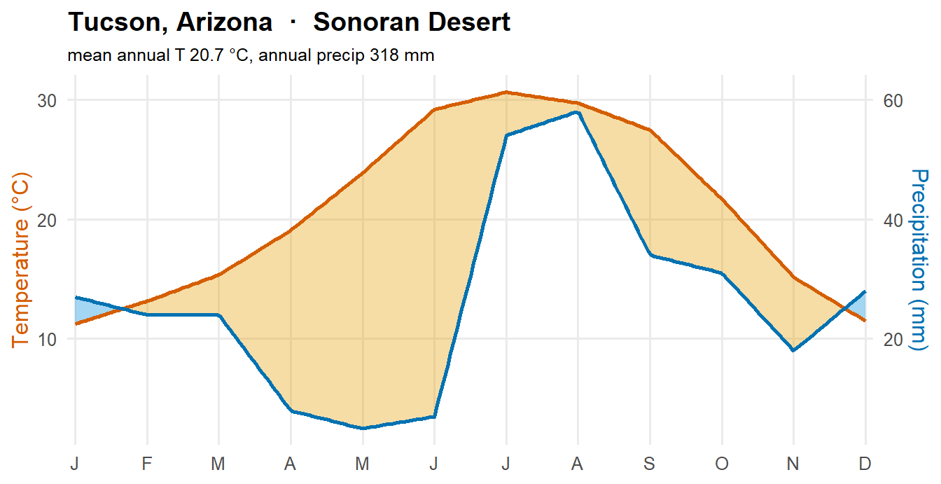
## Tucson, in the heart of the Sonoran Deserttuc <- trio_m |>filter(name =="Tucson") |>arrange(month)walter_lieth(tuc, "Tucson, Arizona · Sonoran Desert",paste0("mean annual T ", round(mean(tuc$tavg), 1)," °C, annual precip ", round(sum(tuc$prec)), " mm"))
The blue surplus all but vanishes. What survives are two thin slivers, one in winter and one when the summer monsoon breaks in July and August, with a parched gap between them. The orange drought wedge swells to fill nearly the whole year. Rome’s year is mostly surplus with a brief dry pause; Tucson’s is mostly deficit with two short wet pulses. That inversion is the desert’s seasonality, and the two slivers are the Sonoran’s bimodal signature, the detail that will separate it from its neighbors.
Both diagrams are our own drawing, built directly from the two-to-one rule in a few lines of R. The classic versions, with their hatched fills and hand-lettered headers, reek of the drafting table, and the canonical R implementation, the climatol package’s diagwl(), faithfully reproduces that style. We’ve taken a simpler, more modern path: one clean 2:1 scale, no perhumid compression of very wet months, and no frost line, because our warm sites never trigger them. The frost line would need monthly minimum temperatures, which WorldClim provides, and a colder site later in the voyage could add it back.
2.2 From the diagram to a single number
The diagram is a picture. To compute with it, we read off the one quantity it’s built from: the gap between the rain and twice the temperature, month by month. Call it the moisture value,
\[m = P - 2T\]
where P is the month’s precipitation in millimeters and T its mean temperature in degrees Celsius. When m is positive the month is wet; when it’s negative the month is in deficit. Strung across twelve months, m is a moisture curve: a single cyclic signal that carries the diagram’s core fact in a form we can abstract.
The monthly temperature and rainfall come from WorldClim, a global climatology built from weather-station records. The seasonalityr package retrieves it for any set of points with get_climate(). Because WorldClim is a large one-time download, we ran that retrieval once and saved the trio’s monthly normals to a small file, which the chunk above read back. The full retrieval, with its caching and resolution choices, is laid out in the appendix, Retrieving WorldClim Data.
2.3 The three deserts, side by side in time
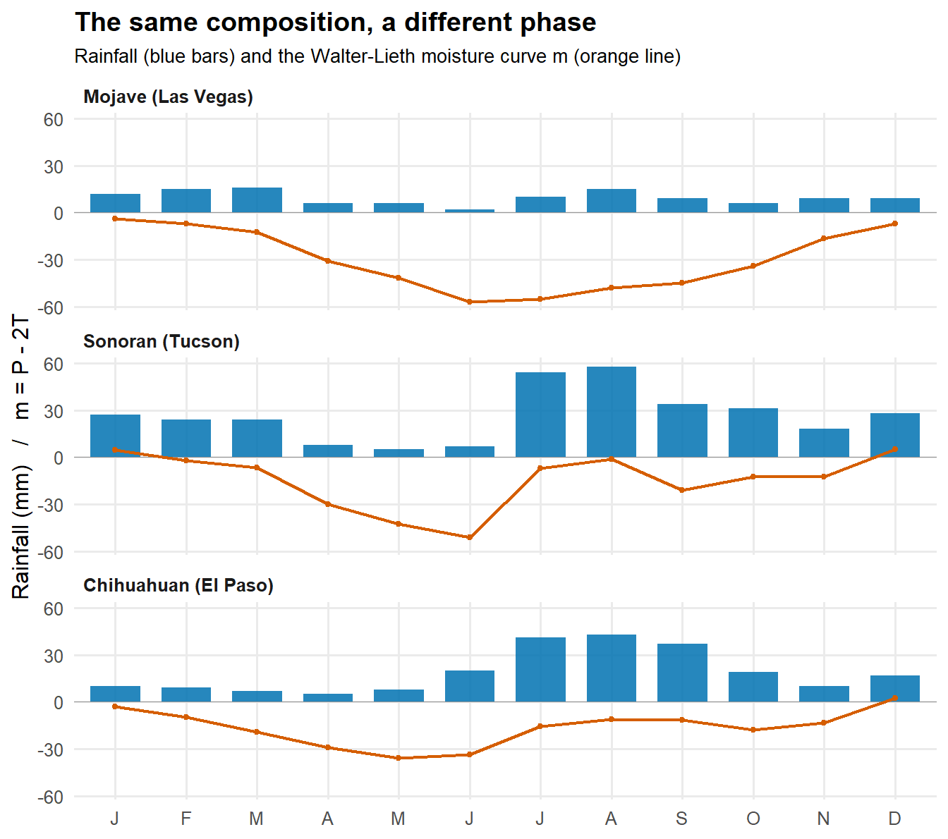
Now plot all three together, stacked from west to east. The blue bars are monthly rainfall, the part of the diagram you can see directly. The orange line is the moisture value m, the water balance after evaporation is charged against the rain.
Show the code
## order the panels west to easttrio_m$desert <-factor(trio_m$desert,levels =c("Mojave (Las Vegas)", "Sonoran (Tucson)", "Chihuahuan (El Paso)"))## one-letter month labelsmonth_lab <-c("J","F","M","A","M","J","J","A","S","O","N","D")ggplot(trio_m, aes(month)) +## rainfall: the phase you can seegeom_col(aes(y = prec), fill ="#0072B2", width =0.7, alpha =0.85) +## the moisture curve m = P - 2T, with a zero referencegeom_hline(yintercept =0, colour ="grey60", linewidth =0.3) +geom_line(aes(y = m), colour ="#D55E00", linewidth =0.8) +geom_point(aes(y = m), colour ="#D55E00", size =1.1) +facet_wrap(~ desert, ncol =1) +scale_x_continuous(breaks =1:12, labels = month_lab, expand =c(0.02, 0)) +labs(x =NULL, y ="Rainfall (mm) / m = P - 2T",title ="The same composition, a different phase",subtitle ="Rainfall (blue bars) and the Walter-Lieth moisture curve m (orange line)") +theme_minimal(base_size =12) +theme(panel.grid.minor =element_blank(),plot.title =element_text(face ="bold"),plot.subtitle =element_text(size =10),strip.text =element_text(face ="bold", hjust =0))
Read the bars first. The Mojave is dry all year, with what little rain it gets leaning toward the cool months. The Chihuahuan is a summer-rain desert, its rain stacked into July, August, and September. The Sonoran does something different again: it rains twice, once in winter and once in a hard summer monsoon, with a dry gap between, the same bimodal year the diagram drew.
Now read the orange line. In all three it spends almost the whole year below zero. These are arid places, and the moisture balance says so. Notice too that the line’s high points sit in winter even for the Chihuahuan and Sonoran, whose rain falls in summer. That’s because the warm-season term 2T is large enough to swamp the summer rain in the balance. The moisture curve is a faithful measure of how dry a place is, but its timing follows the temperature, not the rain. We’ll make use of that split later: aridity from m, but the timing of the rain from the rain itself.
2.4 Why this is not a two-way table
Here’s the trap the diagram sets, and the reason this project doesn’t reduce to a familiar tool. Suppose we did the obvious thing and tallied each desert’s months into wet and dry, then built a table of deserts against month-types. Counting by the moisture value, the Mojave has no wet months at all, the Chihuahuan has one, and the Sonoran has two. By that tally the three deserts are nearly identical, three piles of dry months with a wet month or two on top.
Show the code
## tally each desert's months as wet (m > 0) or drytrio_m |>group_by(desert) |>summarise(wet_months =sum(m >0),dry_months =sum(m <=0),.groups ="drop") |>gt() |>tab_header(title ="By composition alone, the three deserts look alike") |>tab_source_note(source_note = source)
By composition alone, the three deserts look alike
desert
wet_months
dry_months
Mojave (Las Vegas)
0
12
Sonoran (Tucson)
2
10
Chihuahuan (El Paso)
1
11
Monthly normals from WorldClim 2.1 (10 arc-minute), via seasonalityr.
A table like that would call them the same place. But they obviously aren’t, and the figures already showed why. The information that separates them isn’t which months they have, it’s when those months fall and in what order. A presence-and-absence table discards exactly that. This is the lesson of an earlier project carried into a new setting: the distance you choose decides what you can see, and the easy distance here is blind to the one thing that matters.
So instead of counting states, seasonalityr measures the shape of the year. The compute_indices() function takes a site’s twelve months of rain and temperature and returns a handful of numbers that capture phase and sequence. Two of them carry the deserts’ difference. The cool-season fraction, cool_frac, is the share of the year’s rain that falls in the six coldest months: high for a winter-rain desert, low for a summer-rain one. The bimodality index, bimod, rises when the rain comes in two separate pulses rather than one.
Show the code
## compute_indices() takes one site's rainfall and temperature vectorslas_vegas <-filter(trio_m, name =="Las Vegas") |>arrange(month)compute_indices(P = las_vegas$prec, T = las_vegas$tavg)
## indices_table() runs the same computation across many sites at oncetrio_tidy <- trio_m |>mutate(zone ="subtropical") |>select(name, zone, month, tavg, prec)trio_index <-indices_table(trio_tidy)trio_index |>select(name, cool_frac, bimod, SI, totP, m_mean) |>gt() |>fmt_number(columns =c(cool_frac, bimod, SI, m_mean), decimals =2) |>tab_header(title ="By phase, they separate cleanly") |>tab_footnote(footnote ="Fraction of annual rain in the six coldest months.",locations =cells_column_labels(columns = cool_frac)) |>tab_footnote(footnote ="Two-pulse (bimodal) rainfall index; gated to zero below a seasonality floor.",locations =cells_column_labels(columns = bimod)) |>tab_footnote(footnote ="Annual rainfall, millimeters.",locations =cells_column_labels(columns = totP)) |>tab_source_note(source_note = source)
By phase, they separate cleanly
name
cool_frac1
bimod2
SI
totP3
m_mean
El Paso
0.26
0.56
0.58
226
−16.57
Las Vegas
0.58
0.00
0.35
115
−29.89
Tucson
0.41
1.17
0.46
318
−14.81
1 Fraction of annual rain in the six coldest months.
2 Two-pulse (bimodal) rainfall index; gated to zero below a seasonality floor.
3 Annual rainfall, millimeters.
Monthly normals from WorldClim 2.1 (10 arc-minute), via seasonalityr.
The two tables tell opposite stories about the same three places. By composition they’re a near match. By phase they fall apart cleanly: the Mojave reads winter, with well over half its rain in the cool months; the Chihuahuan reads summer, with about a quarter; and the Sonoran sits between them with the high bimodality that marks its two-pulse year. Same months, different seasons.
That’s the whole reason for the chapters that follow. A place’s seasonality lives in the timing and the shape of its year, not in a tally of its parts. The moisture curve gave us the diagram as a number and told us how arid a place is. The indices give us the timing the moisture curve hides. With both in hand, we can start to separate the cues a place offers, which is the next chapter’s work.